
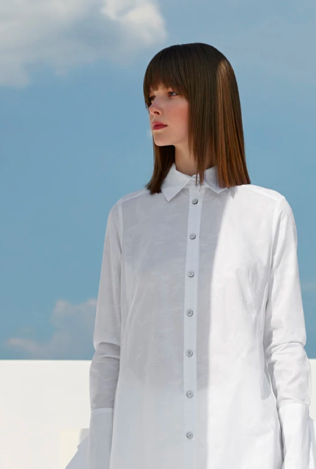
Fata Morgana
Luxury made to move.
Challenge
Fata Morgana challenged us with assessing their existing high-end fashion eCommerce website, explain why it was failing, and making recommendations on how they can increase online sales.
Our Solution
We conducted an in-depth analysis of the site and competitive landscape. We also ran 50 online user tests and synthesized our findings to identify 15 main areas of opportunity. We then presented our best-practice recommendations and took it a step further by putting together a mood board and high level concept of what their online experience could be with easy-to-understand next steps.
Knowledge labs
Strategy, Product Design, User Experience
Industry
E-Commerce
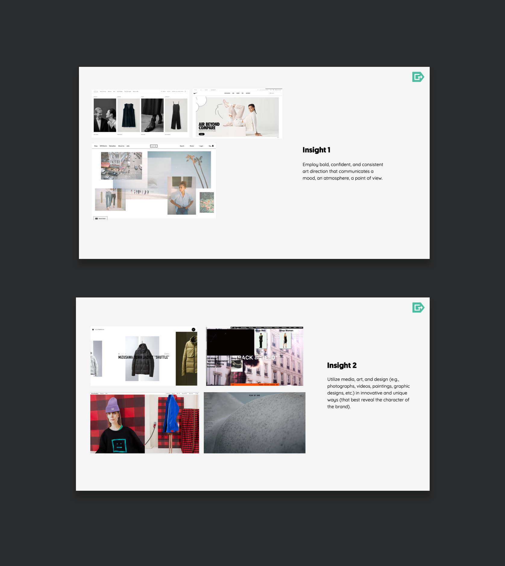
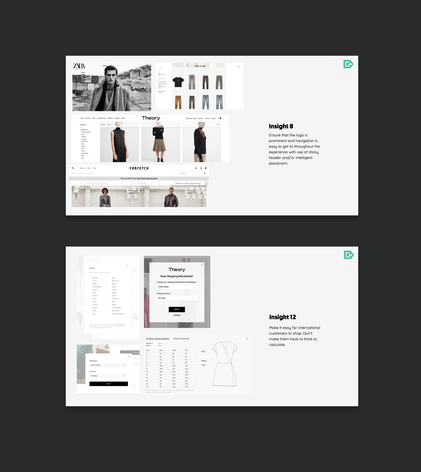
UX & Design Audit
We conducted in-depth assessment and provided recommendations tailored around their new vision of Casual Luxury.
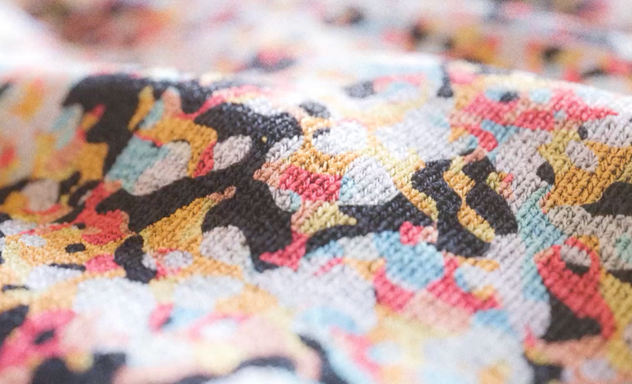
Visual Concept
To bring their vision to life, we designed a visual concept to be used for inspiration and guidance as they built their new site internally.
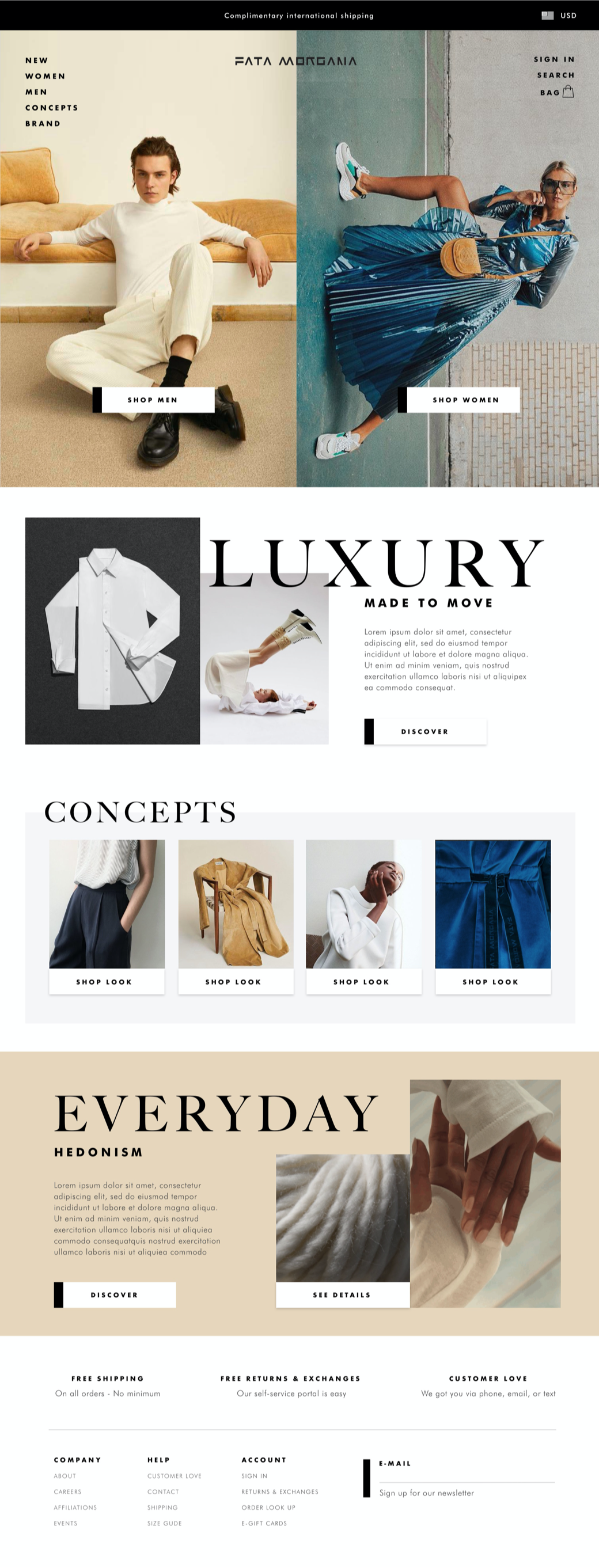
Fata Morgana is an attitude that defies how fashion is seen today.
Related Work
Simon Pearce
Simplicity, quality, and artisanship are the tenets of a better way of life.
Product Design, User Experience, Strategy
Norwegian Cruise Line
Commitment to innovation will continue to raise the bar.
Product Design, User Experience


