Simon Pearce
Simplicity, quality, and artisanship are the tenets of a better way of life.
Challenge
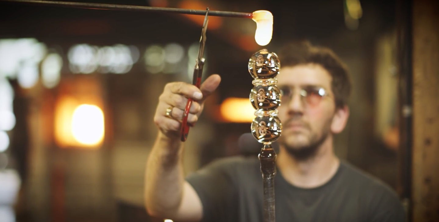
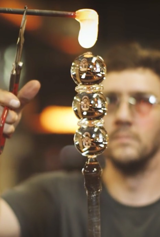
Simon Pearce is a high-end retail and destination brand that sells glass, pottery, and wood tableware. Each piece is handcrafted by professionals in their Vermont Workshop called “The Mill”. They pride themselves in creating extraordinary pieces that are designed with timeless simplicity and can be used for everyday moments. They were very a design-centric client to work with who presented us with an utmost interesting challenge to solve. How do you convey all of the heritage, artisanship, quality, and handmade authenticity into an online eCommerce experience?
Our Solution
It’s simple. We told their story. Because Simon Pearce has such a rich history and the products are made in a fashion that is practically extinct today, we used radical transparency to successfully showcase this content to users.
Knowledge labs
Product Design, User Experience, Strategy
Industry
E-Commerce
User Experience
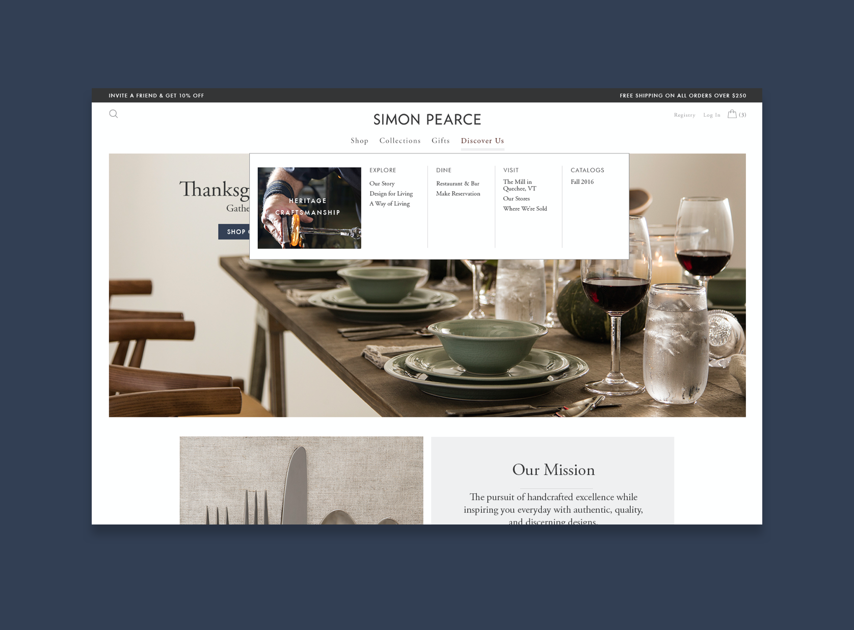
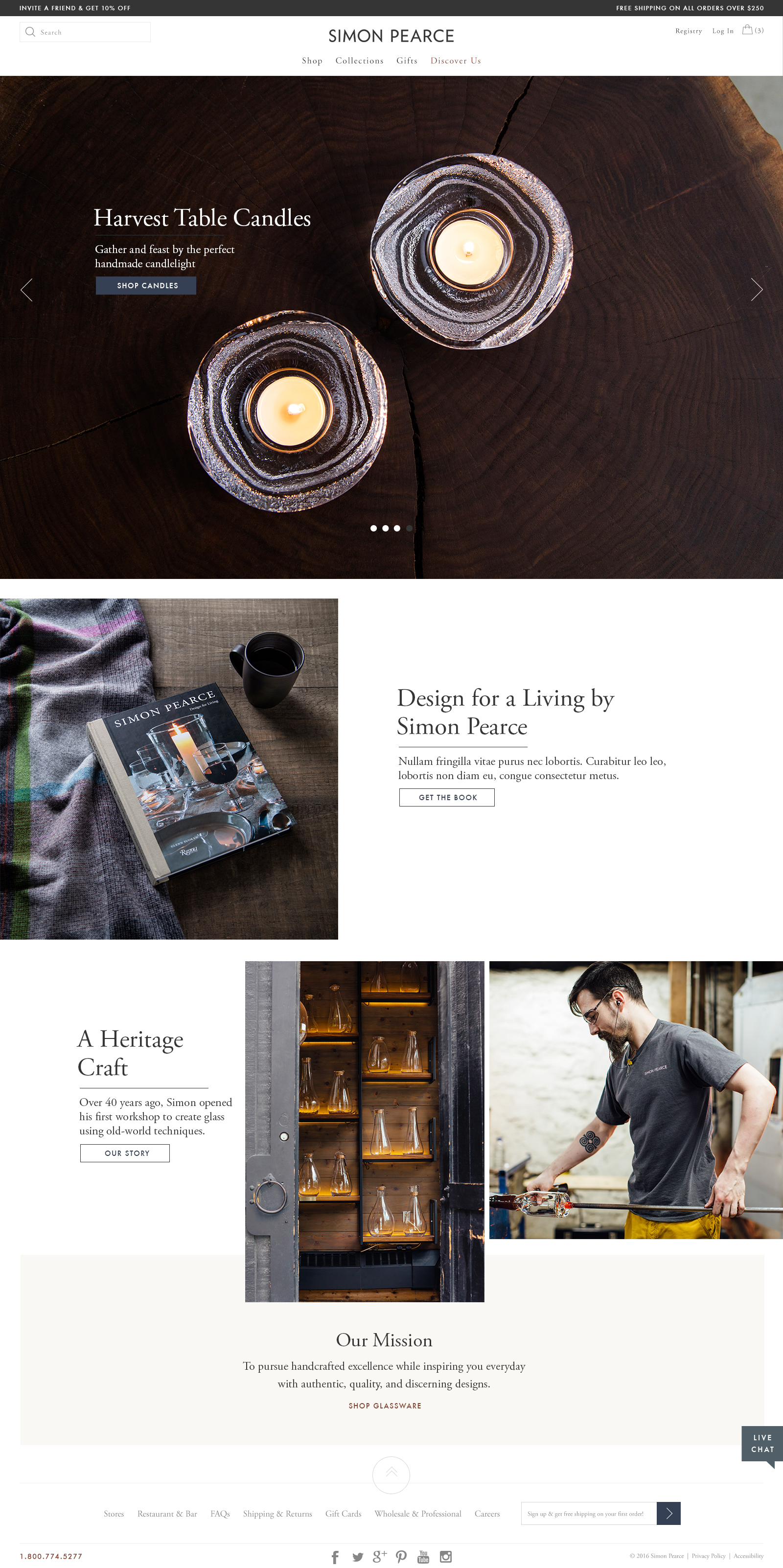
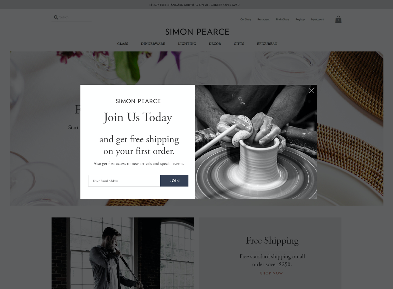
One of the biggest improvements we made to the user experience was to dramatically declutter the global navigation. We also created a new pillar called “Discover Us” which allows users to learn and explore.
Visual Design
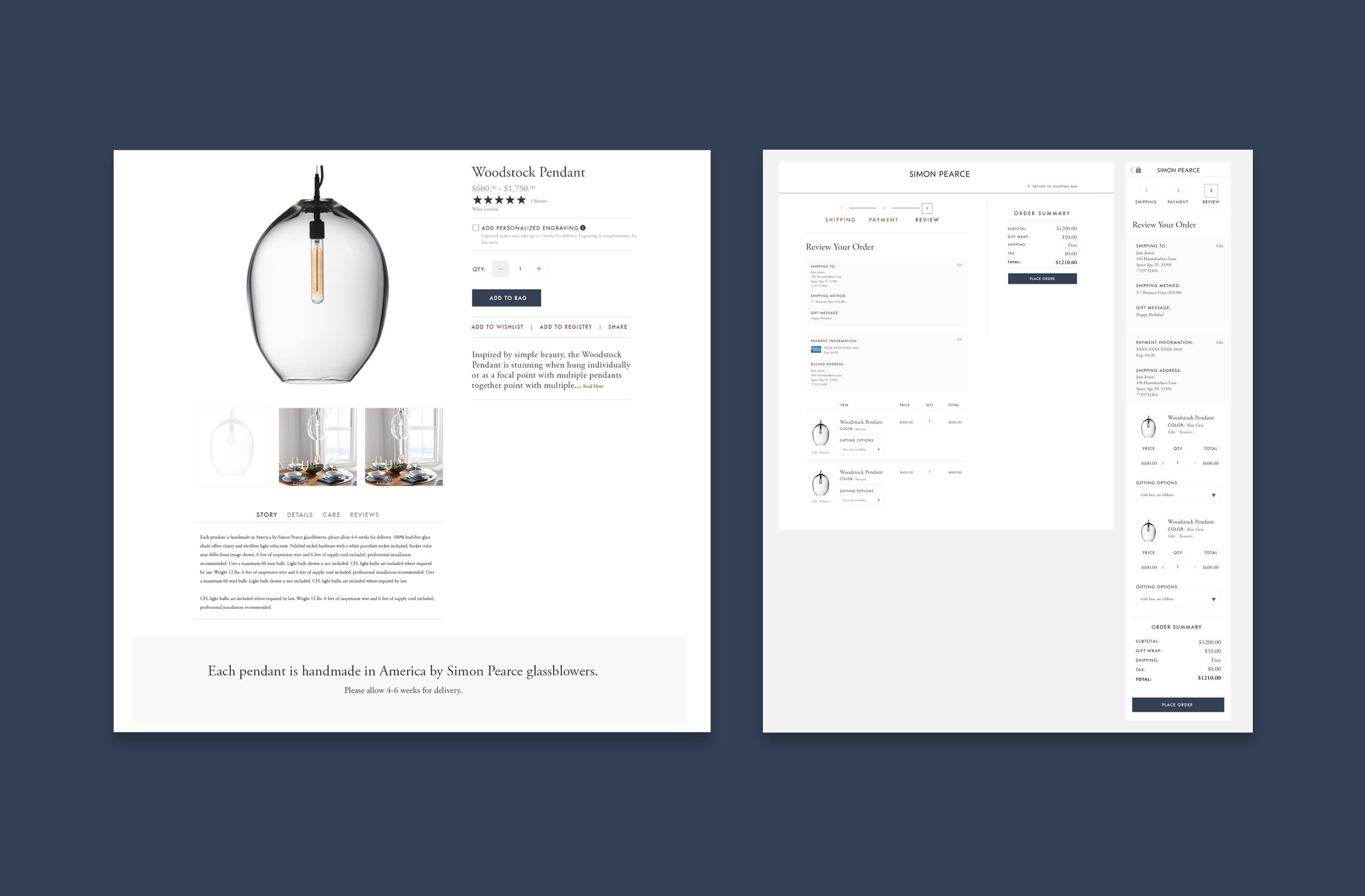
Using a refined and timeless design language system, we introduced pieces of their unique story where relevant, justifying the product’s higher prices with their real value, elegance and craftsmanship.
The new homepage was designed to focus on the story behind the products.
Photography Art Direction
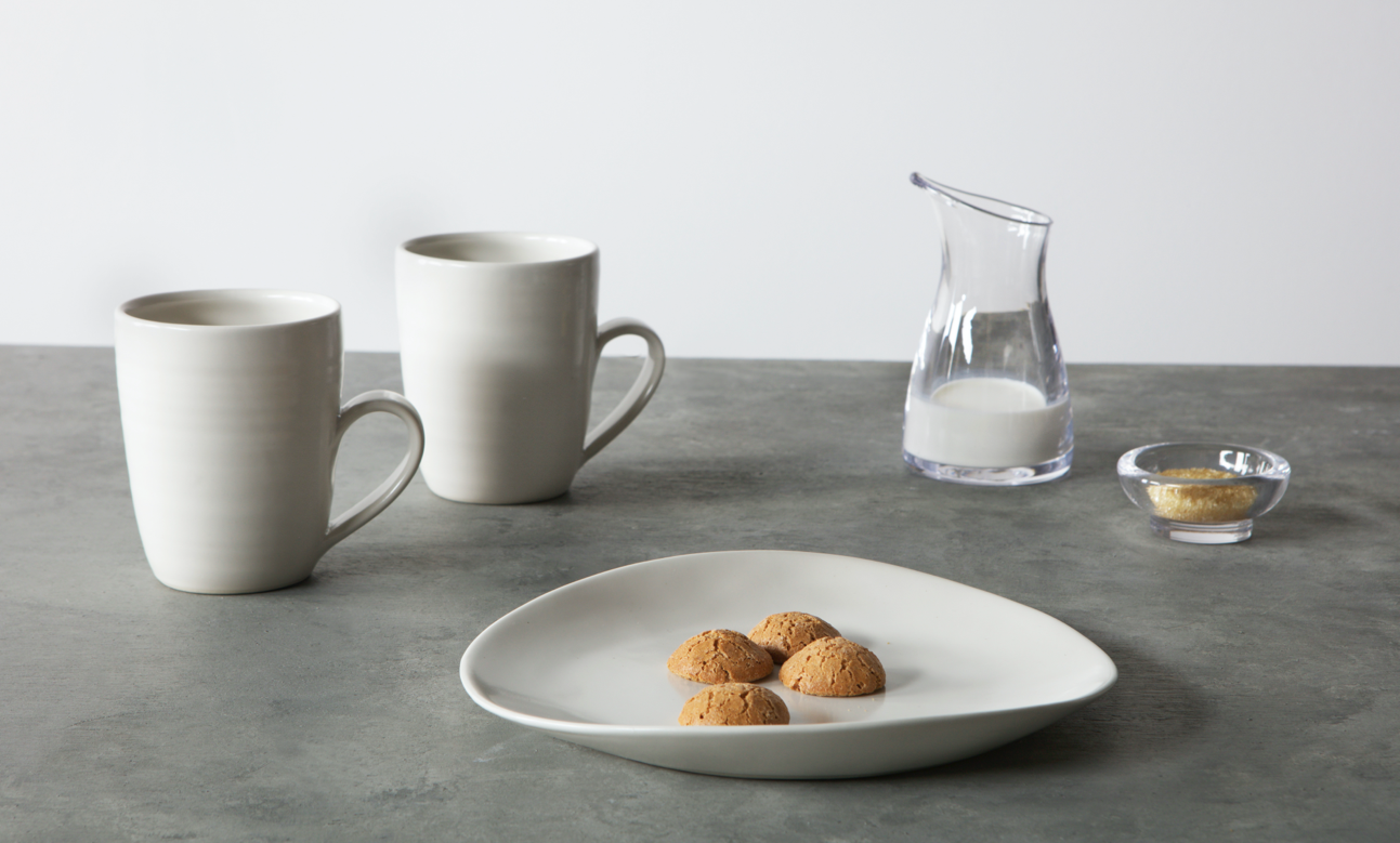
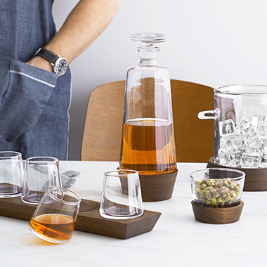
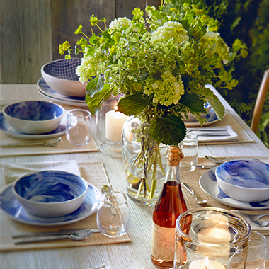
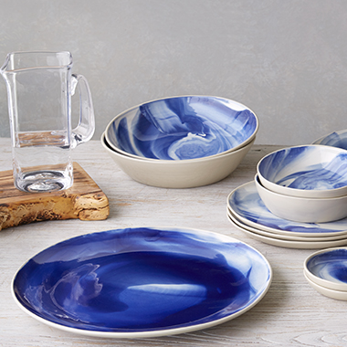
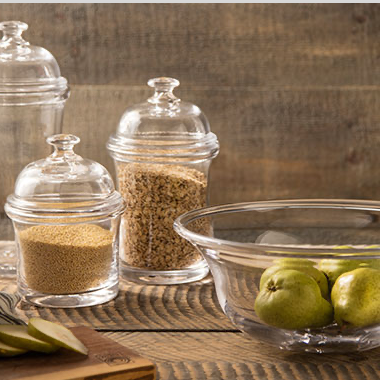
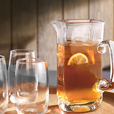
We provided art direction on photoshoots to reflect our vision of users buying something handmade that was designed to last generations.
The Numbers
$62M
revenue growth 2yrs post launch
3.6%
conversion rate increase
An industry icon that exudes meaning, authenticity, and grace.
Related Work
Norwegian Cruise Line
Commitment to innovation will continue to raise the bar.
Product Design, User Experience


