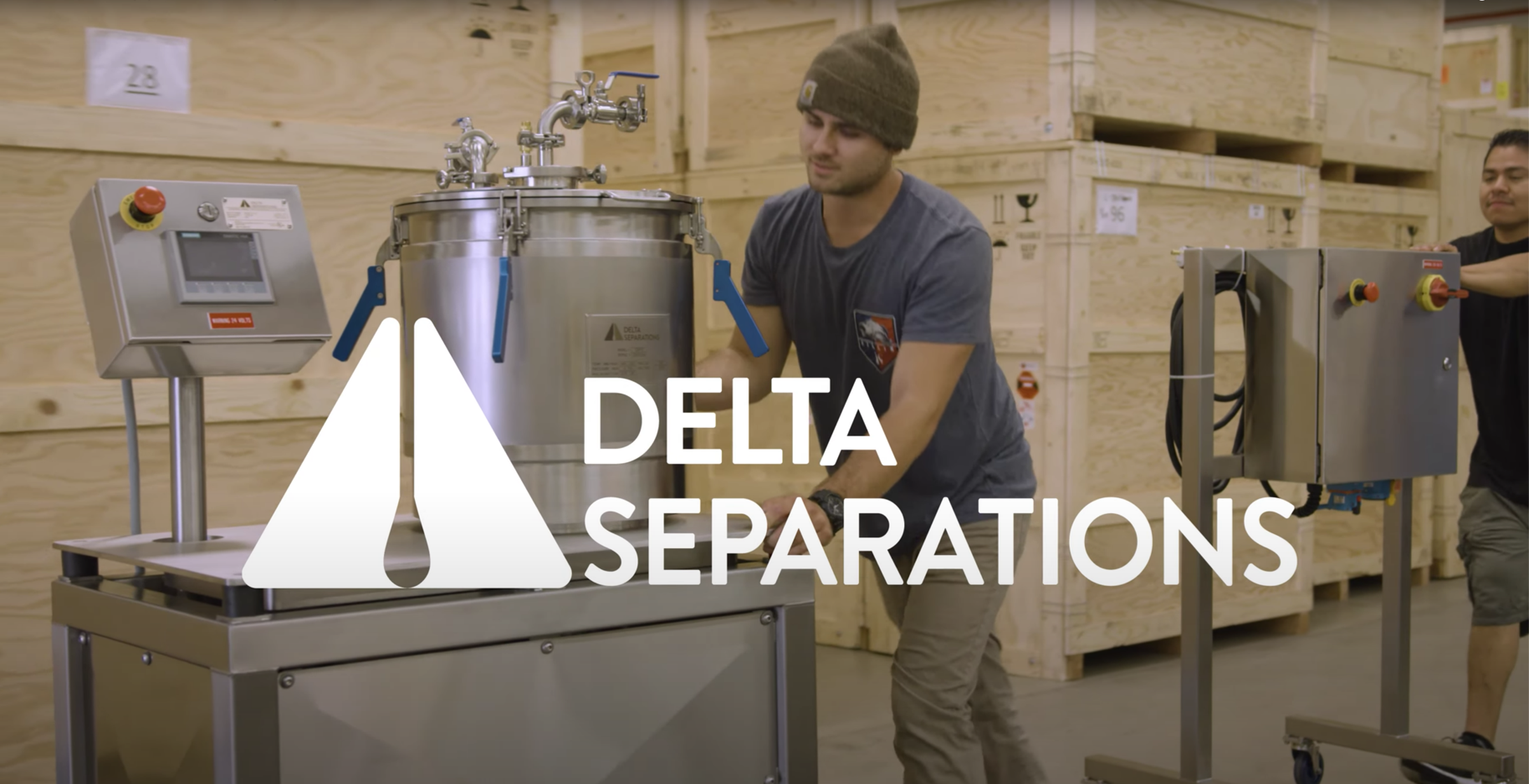
Delta Separations
Safe extraction of high-quality botanical oils.
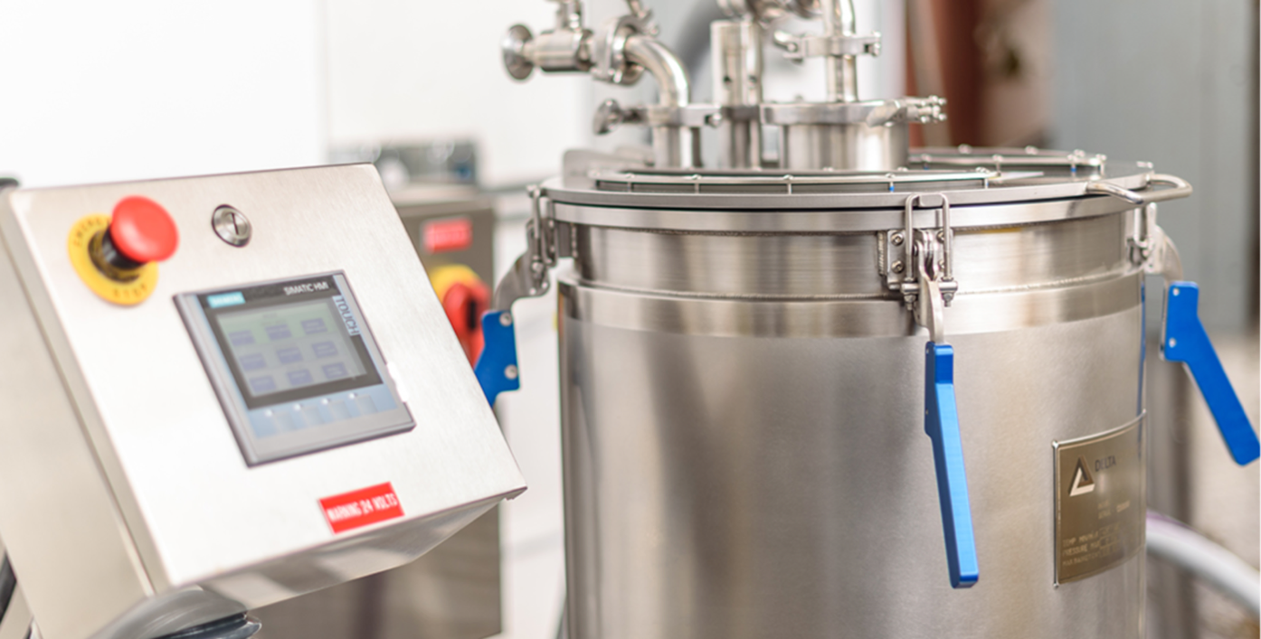
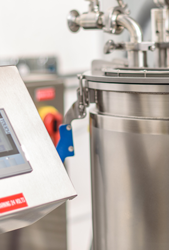
Challenge
We were tasked with creating branding for a leading manufacturer of cannabis extraction equipment. Since the name Delta is common, we needed to make the new logo be a differentiator in the market.
Our Solution
We redefined the delta shape to incorporate some core elements of the extraction process. Paring this with crisp fonts and a bolder color palettebuilt a easy-to-use logo guide and mini brand-book that helped with consistency as the new logo rolled out company-wide.
Knowledge labs
Industry
Health, Technology
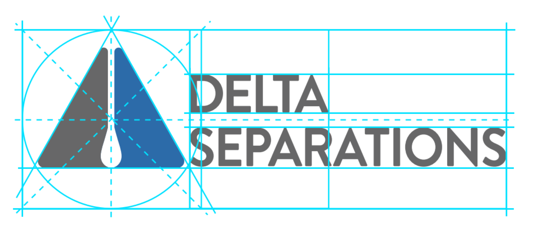
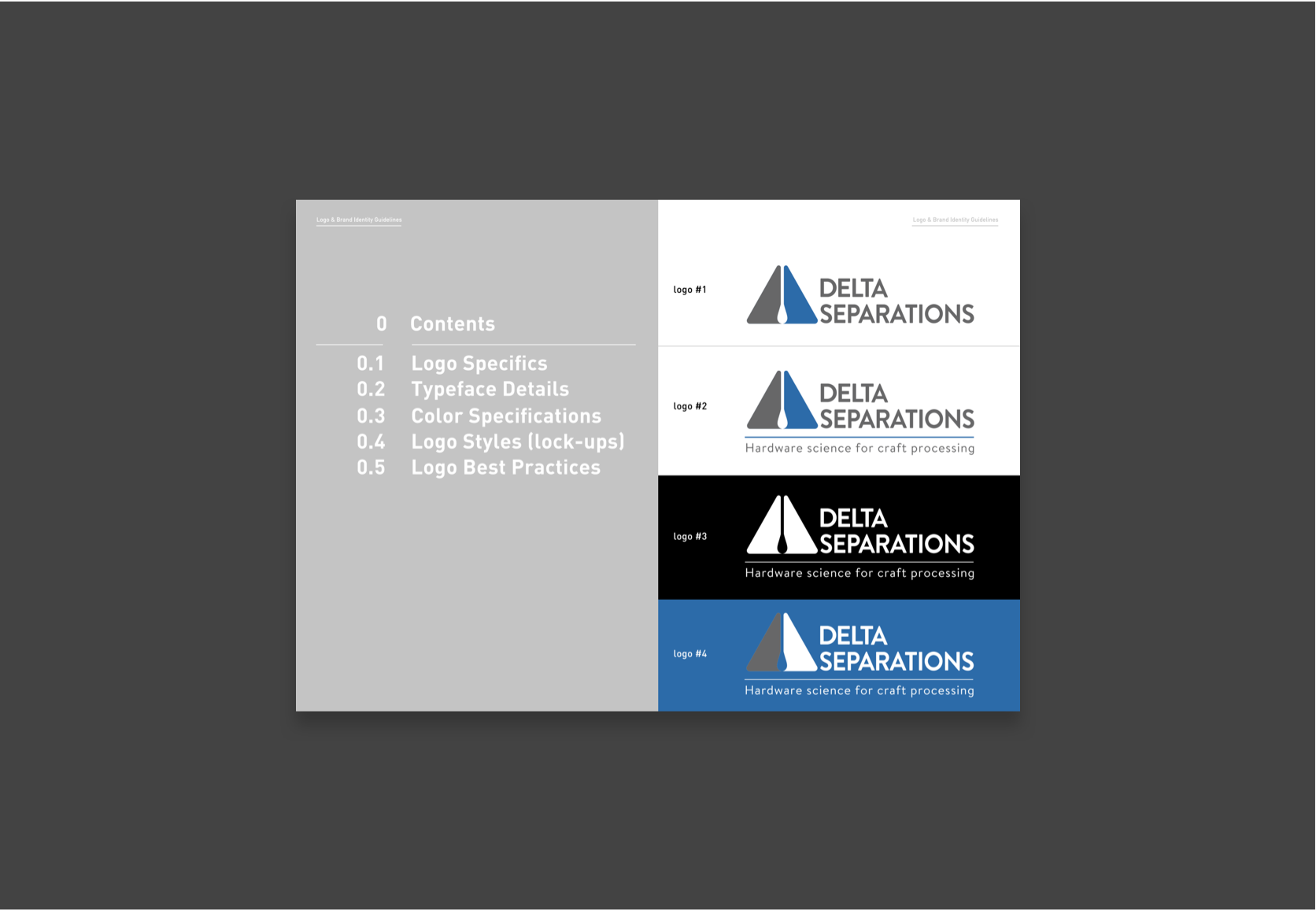
Logo Design
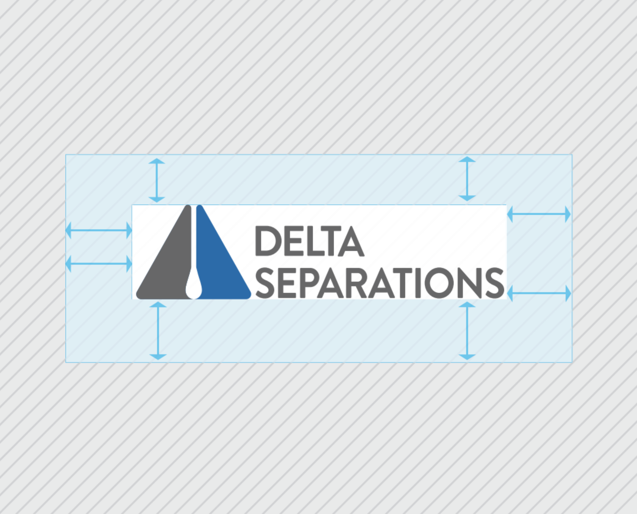
We broke the Delta shape down into its basic elements, then used negative space, creativity, and flat color to give it modern dimension and double meaning.
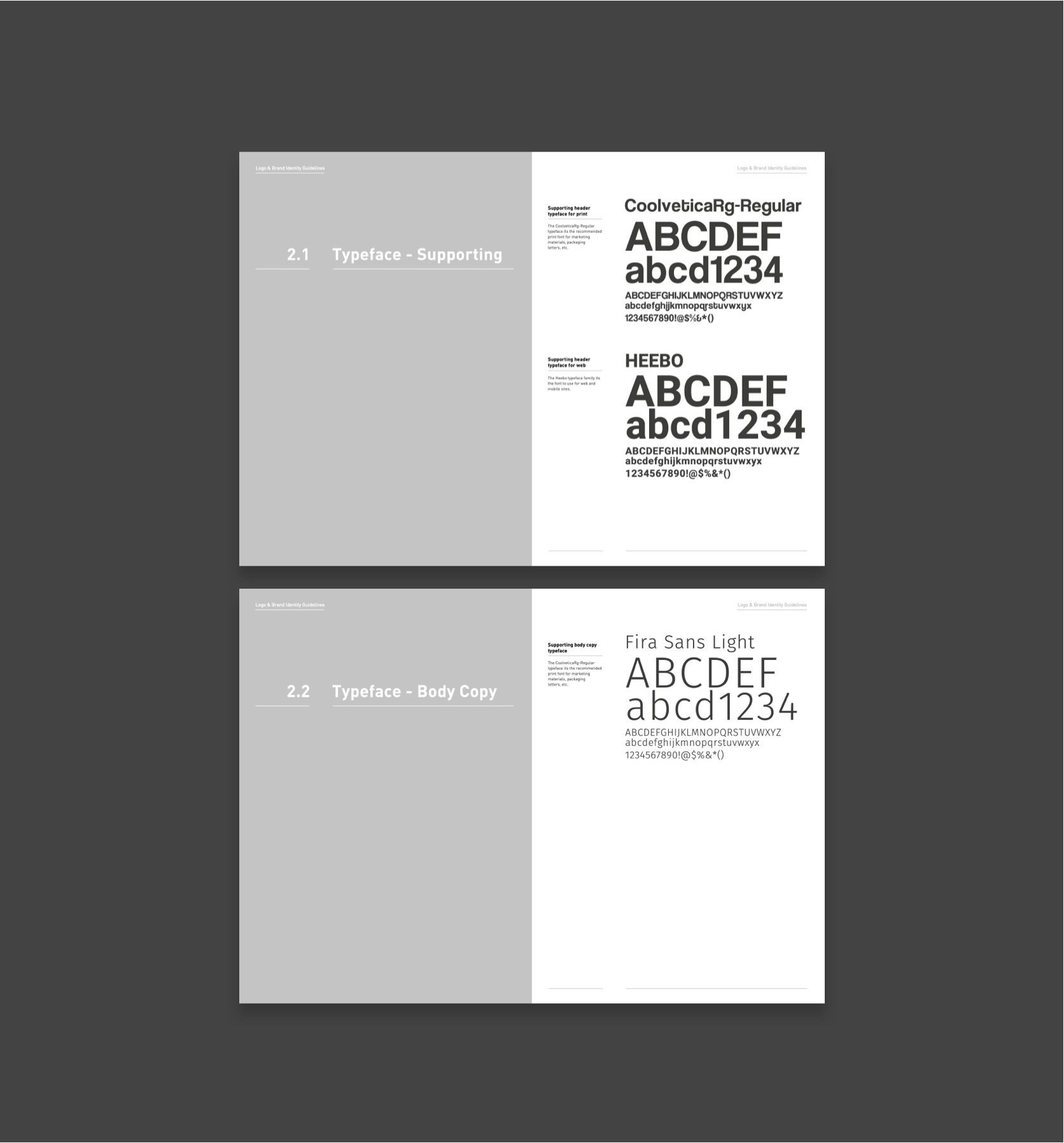
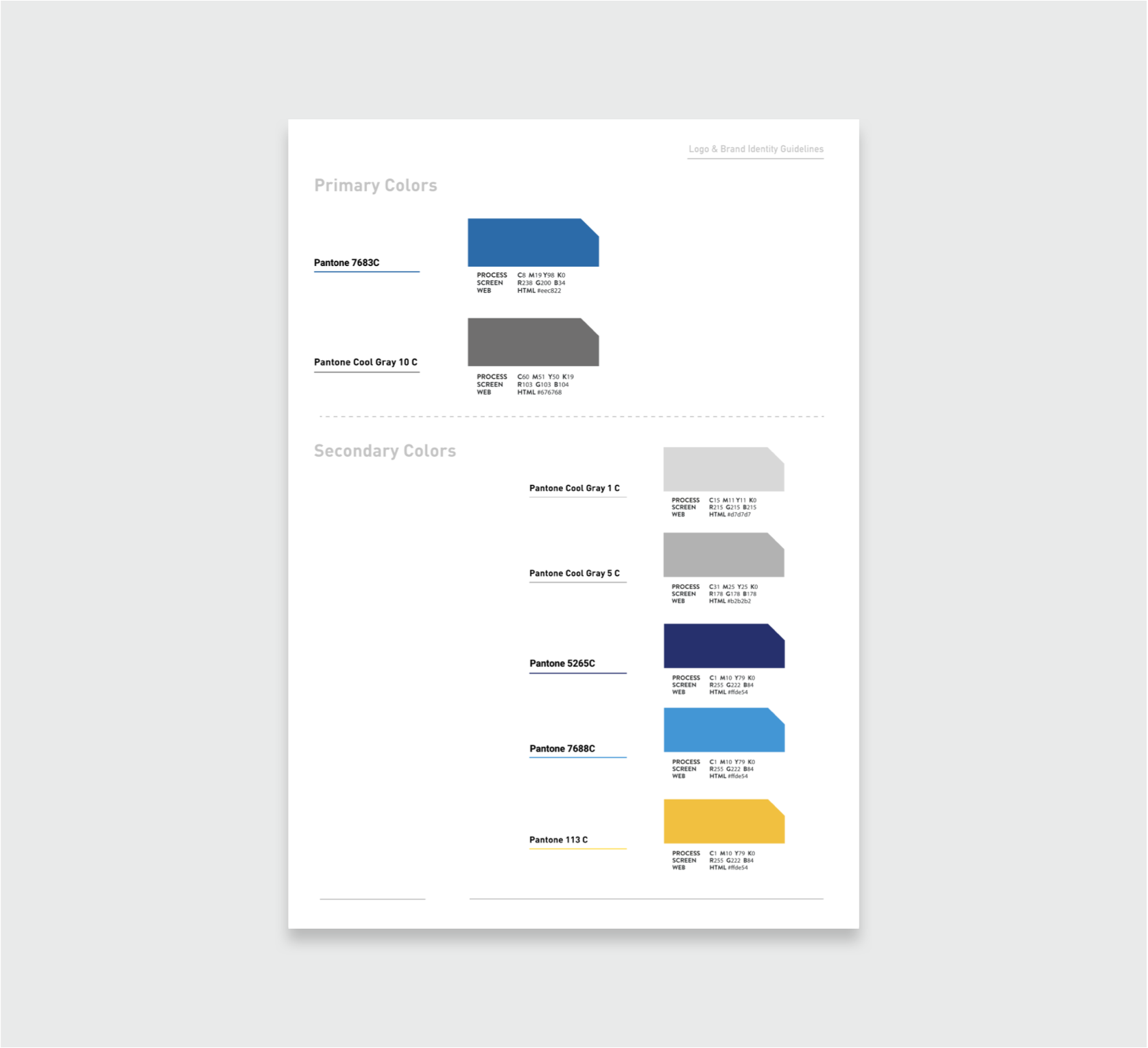
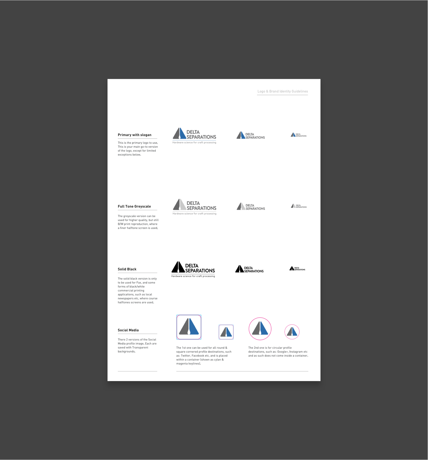
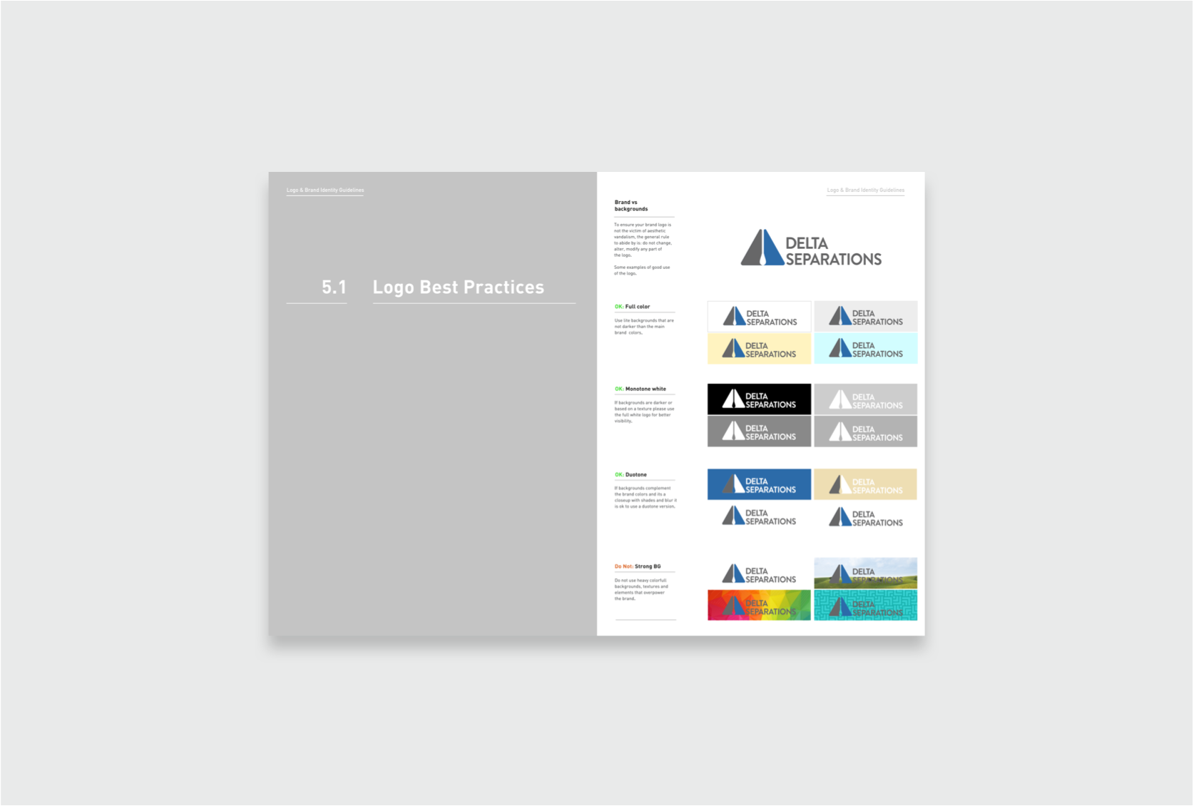
Brand Guide
To support the proper rollout of Delta Separation's new logo, we designed a brand guide for their internal team to use with confidence.
Related Work


Simon Pearce
Simplicity, quality, and artisanship are the tenets of a better way of life.
Product Design, User Experience, Strategy

East to West Development Corporation
Laying the foundation for a new beginning.
Product Design, User Experience, Strategy