Virgin Voyages
A ship is not a ship without its crew.
Challenge
Virgin needed an expert team to guide the user experience and visual design of its large scale ships operations platform. The multi-faceted experience was comprised of 20+ applications that were needed to keep the crew running smoothly and sailors happy - from sailor services, to food & beverage, to housekeeping. With an international crew, and a device fleet of all sizes, it was crucial that it maintain a high level of clarity that was adaptable to a wide range of use cases.
Our Solution
We plugged right into the VV team and led the UX and product design charge by directing, designing and recommending solutions for each app from start to finish. This included the creation of a UI component library + style guide, custom icon library, wireframes, key design screens, user flows, creative direction, QA, as well as product user testing aboard The Scarlet Lady before she set sail. We are still their proud partner today for this initiative, supporting new feature releases, user testing, and optimizations to the experience.
Knowledge labs
User Experience, Product Design, Strategy
Industry
Technology, Travel
User Experience
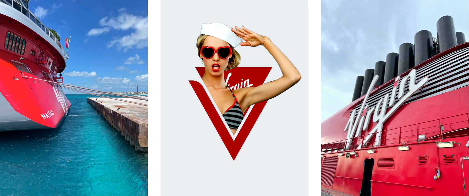
We worked with Virgin Voyages and their development team to lead the creation of wireframes and userflows to solve very complex and niche user scenarios.

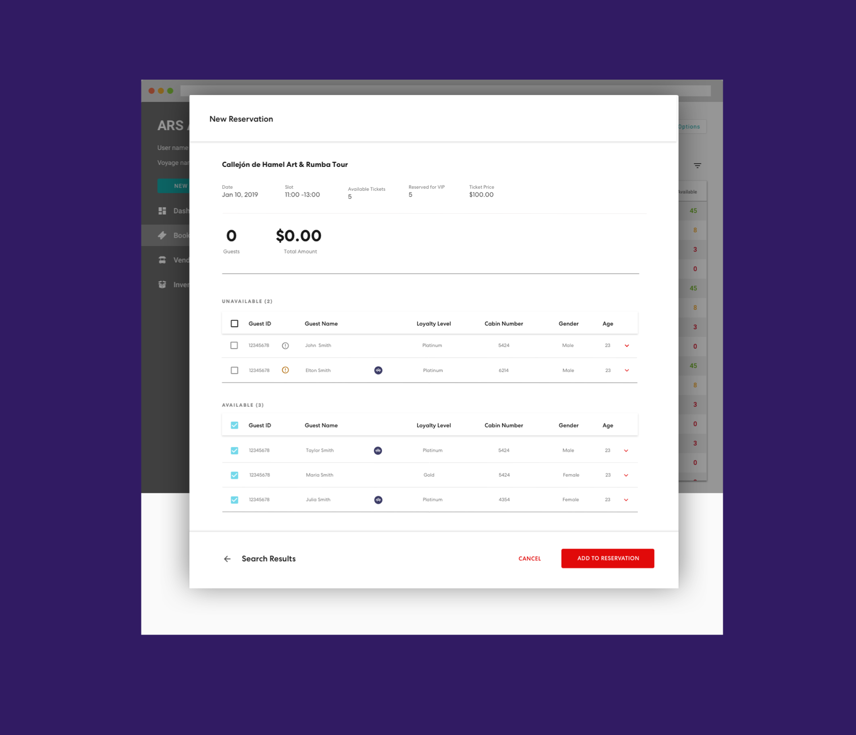
Visual Design
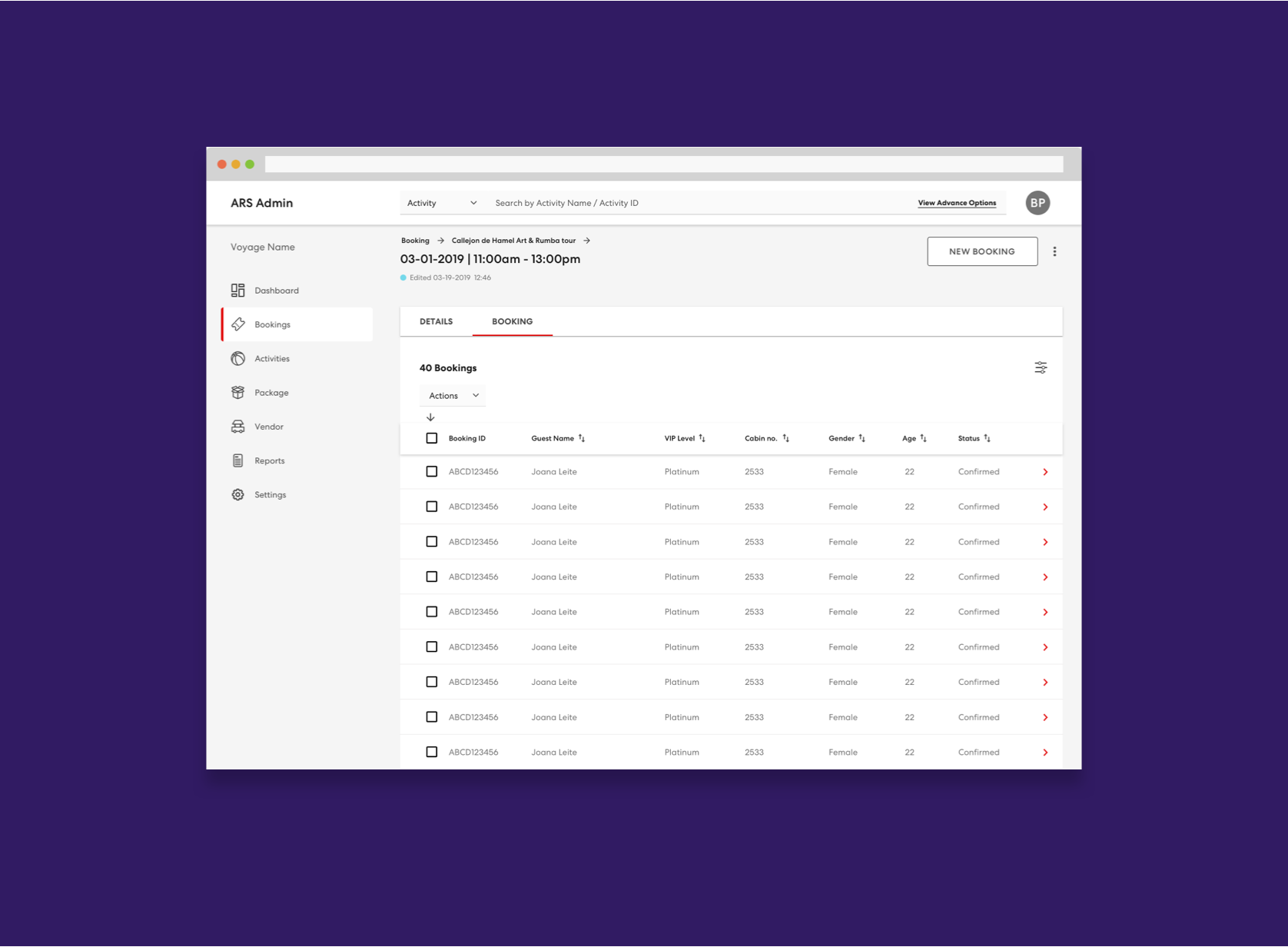
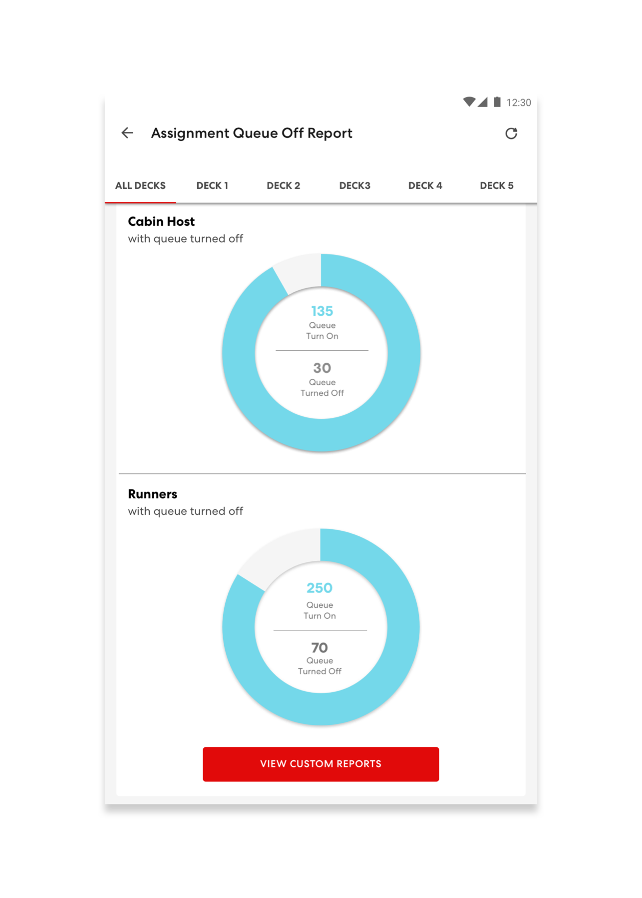
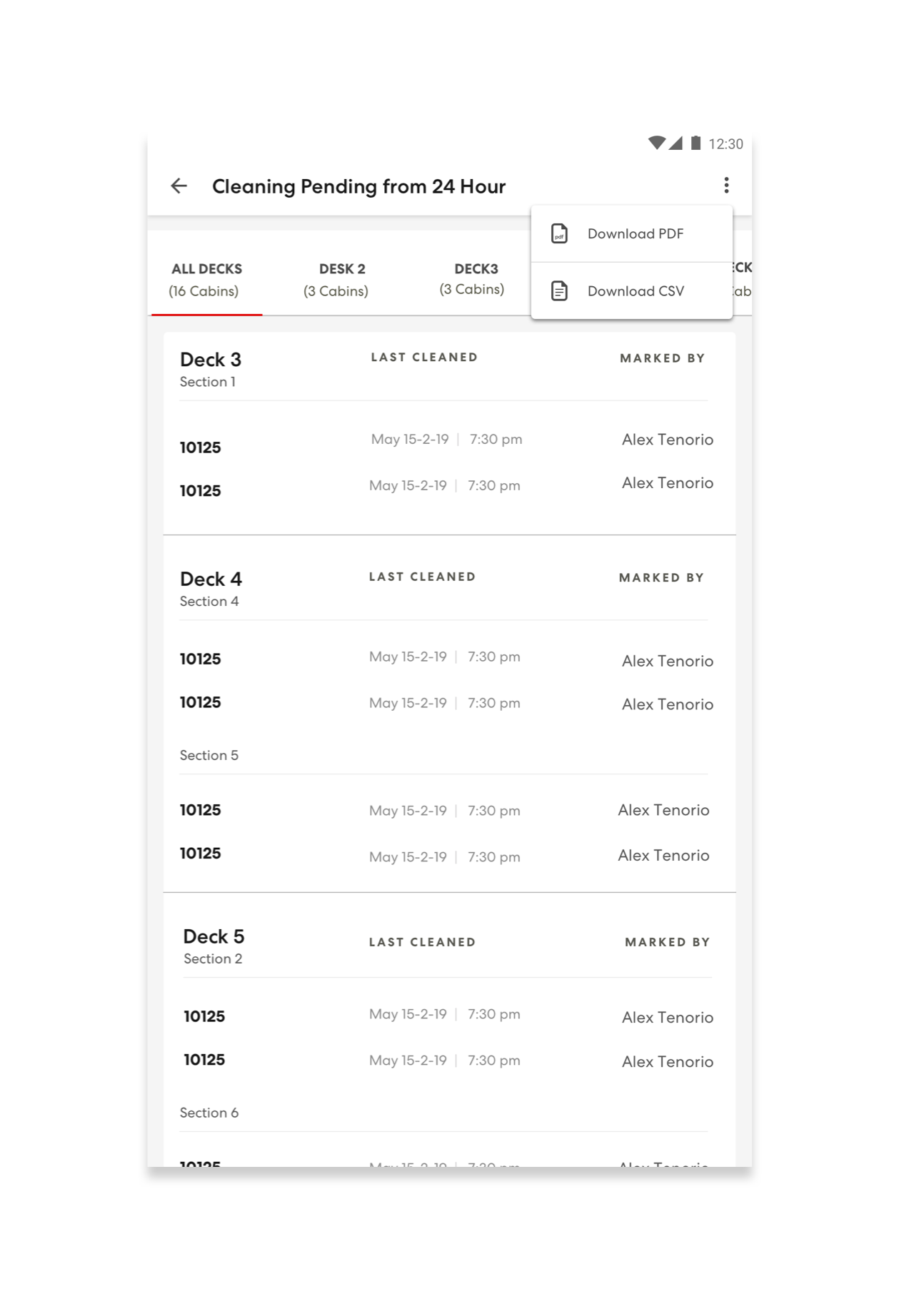
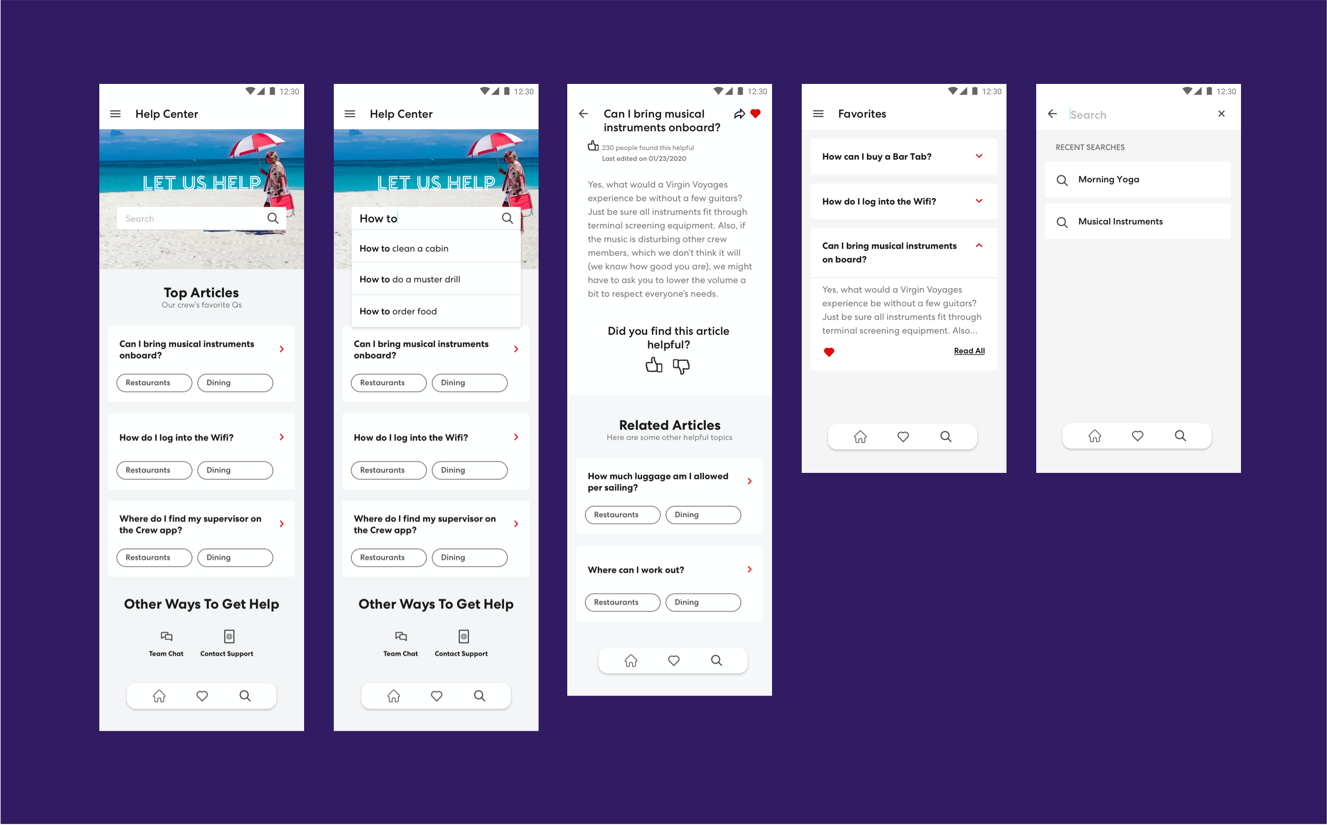
We created a new ADA compliant user interface component library, designed a robust custom icon set, and applied our newly defined design theme to all key screens throughout the desktop, tablet, and mobile app experience.
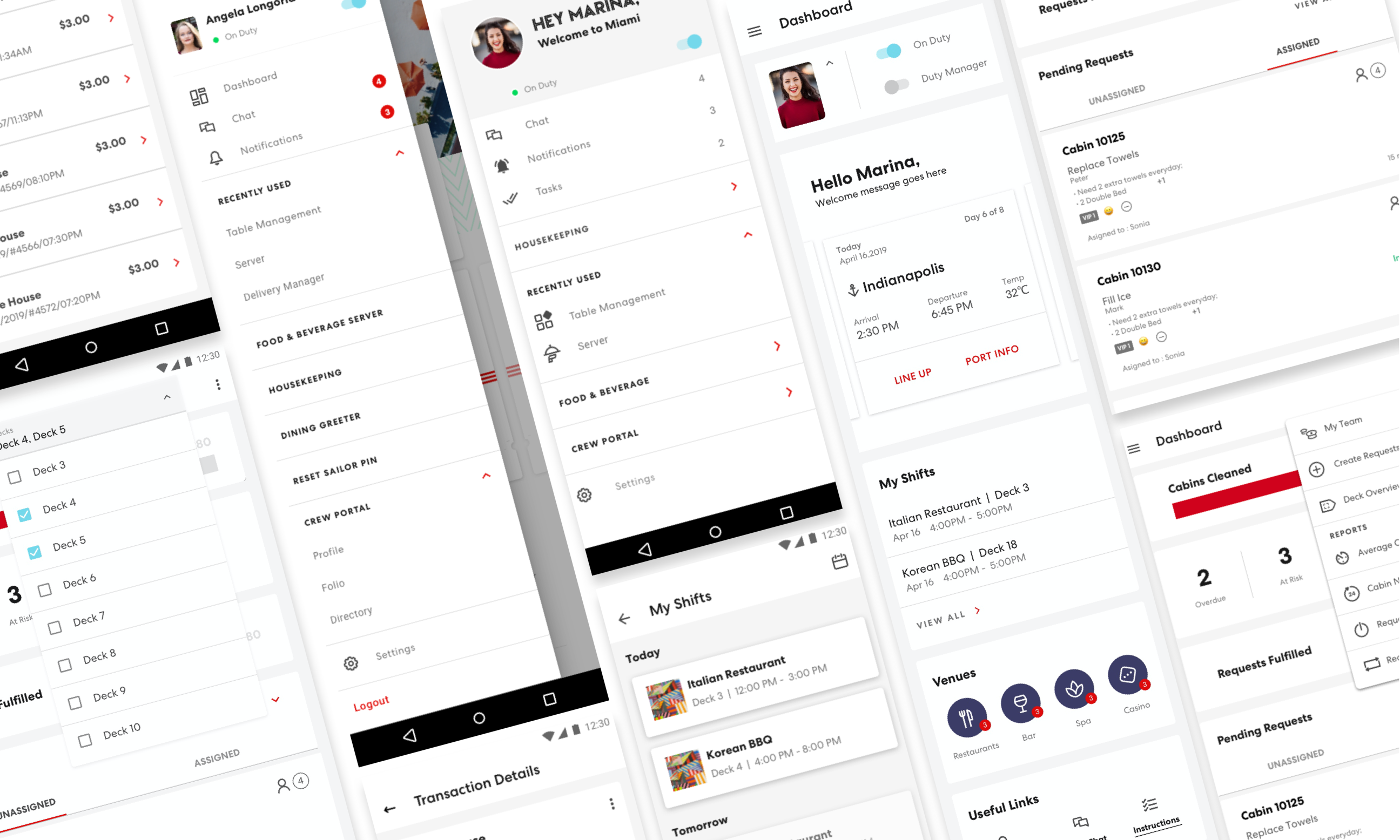
A personalized dashboard was created for each crew member. The dashboard was designed to provide a friendly welcome and showcase the most important information for a successful workday.
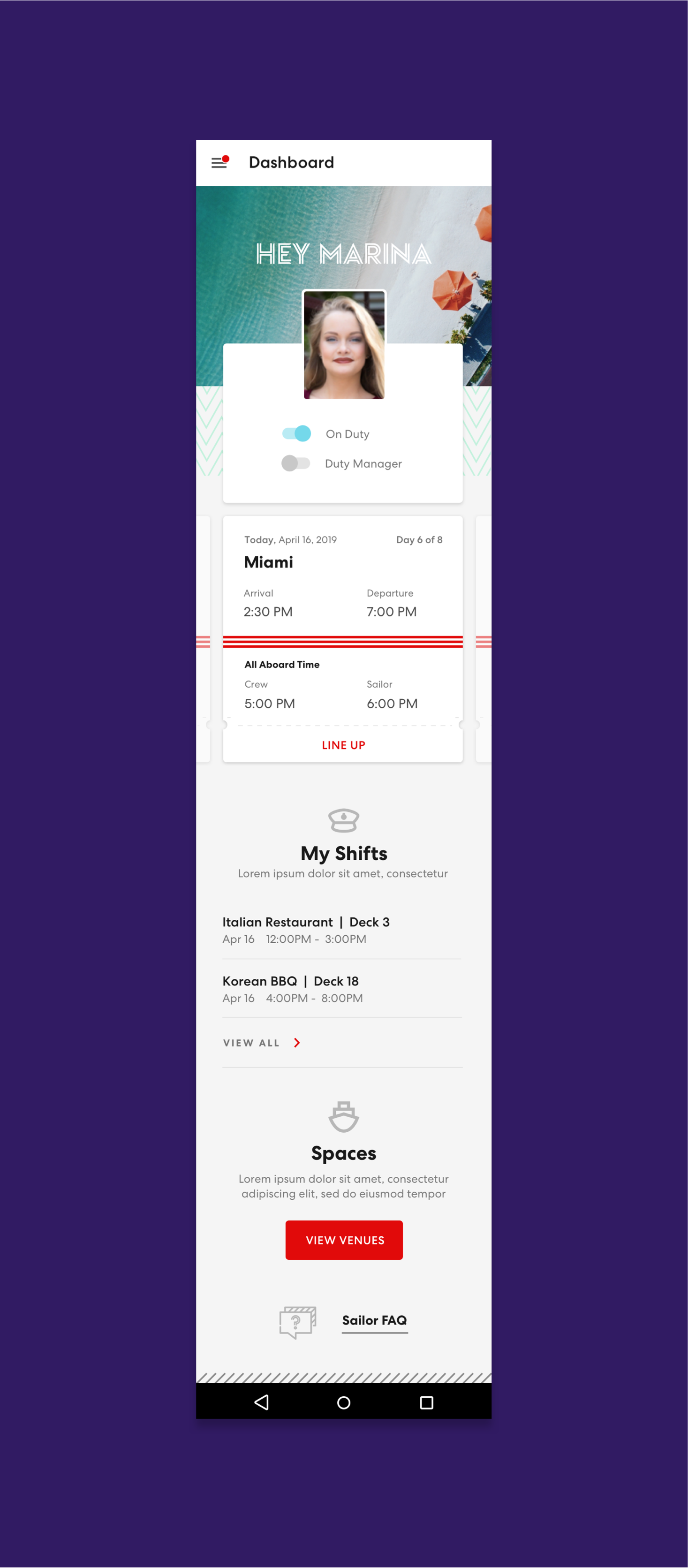
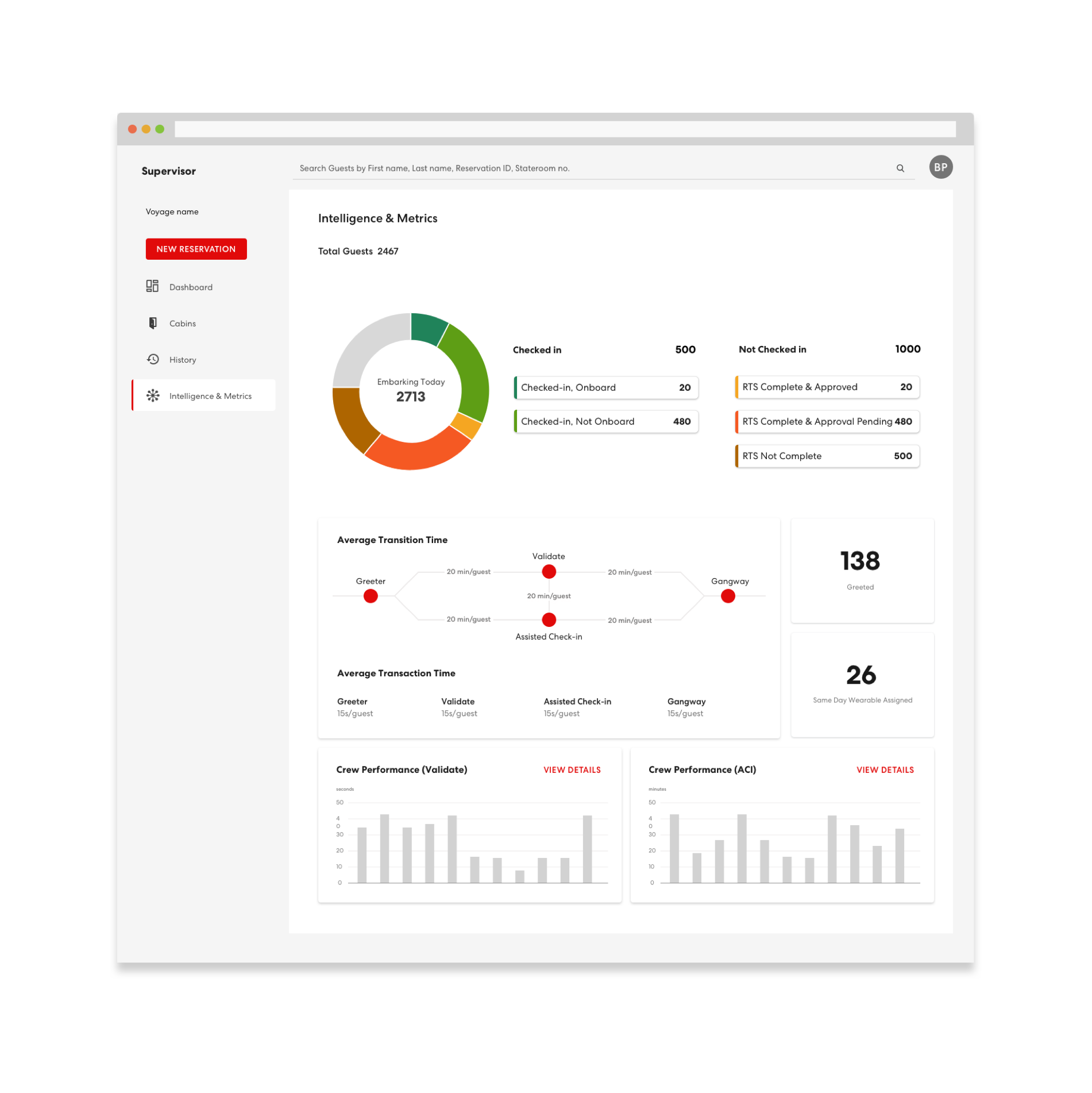
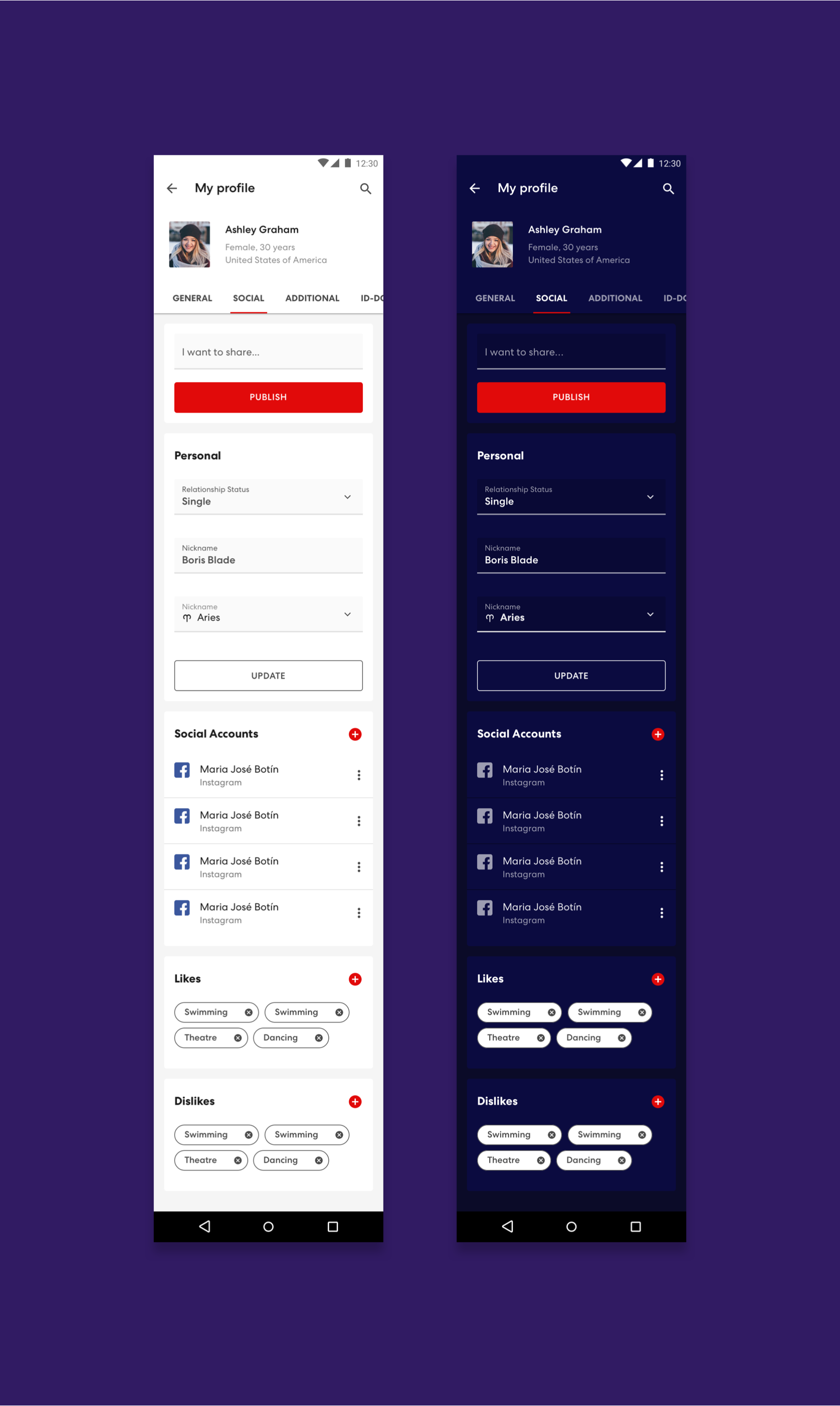
Most apps within the full Crew App Experience were designed with a light and dark mode, since the crew works both day and night. To support this, we created a light and dark theme to be applied across the board.
User Testing
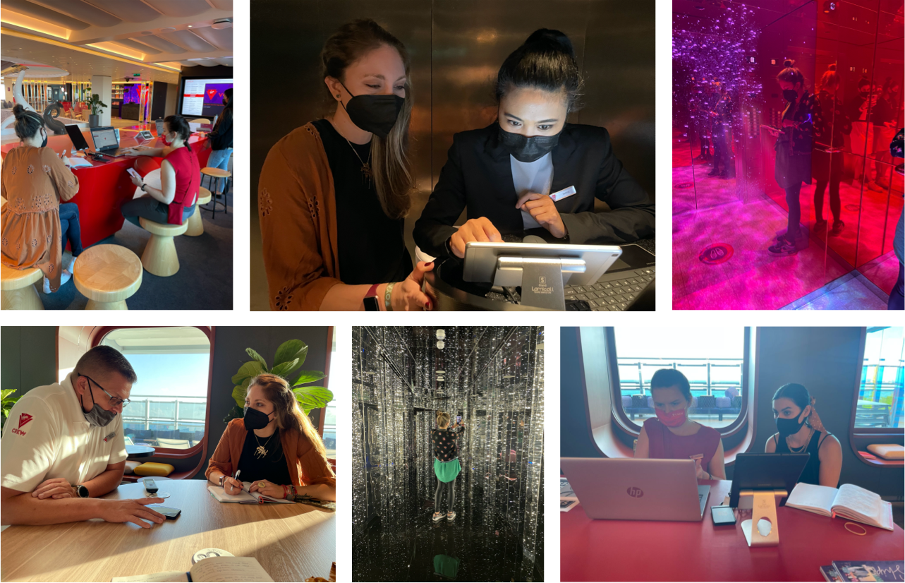
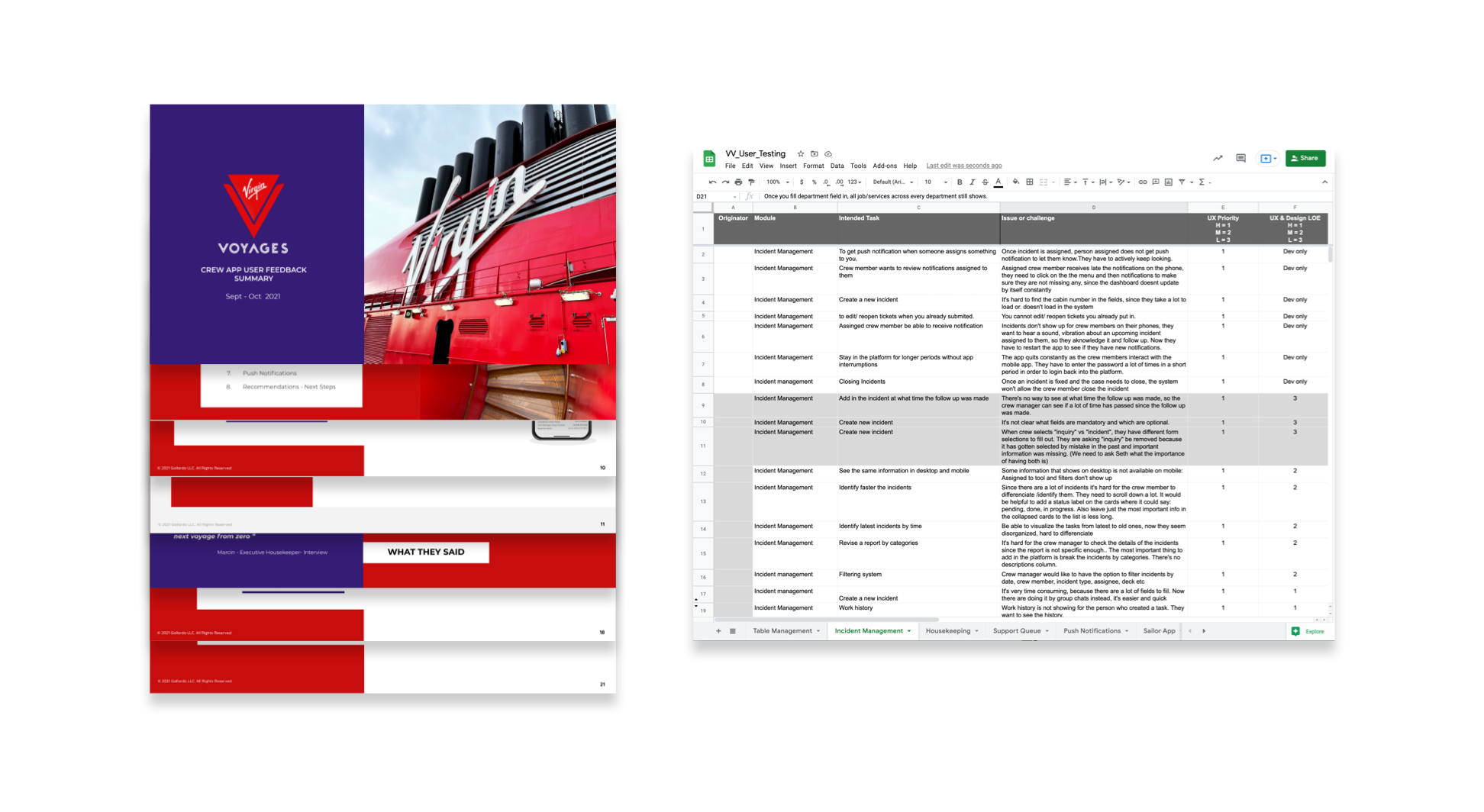
We had the priviledge of getting to test our Crew App solutions onboard The Scarlett Lady with the first crew members on a test voyage. We conducted various exercises and gathered video recordings of our findings. The final deliverable was an executive summary presented to leadership + a prioritized sheet of challenges and opportunities to be addressed in the next round of design optimizations.
The Gallardo Labs team is nothing short of amazing! Their professionalism, level of detail, deliveries, and flexibility to work in the way that works best for the client are unmatched! We feel very grateful to have them as our partners.
- Paola Ortiz, Digital Product Owner
The Numbers
12,000
crew member users
4
ships & counting
Related Work
Norwegian Cruise Line
Commitment to innovation will continue to raise the bar.
Product Design, User Experience


