Virgin Voyages
Yo-Ho! You are now connected.
Challenge
Virgin Voyages invested heavily in wifi satellites for their ships and they tasked us with creating a sailor (aka guest) and crew wifi experience that made their investment worthwhile. They knew this experience was important because for many guests, it would be the first interaction with their digital brand once onboard. They were working with a large development team and many business stakeholders so the solution had to be clearly articulated and seamless.
Our Solution
We worked closely with the Virgin Voyages team to create several user flows and an on-brand UX & visual design concept. We then drew custom illustrations for each key screen and wrote the UX copy to ensure a holistic experience. The delivered designs captured the essence of the brand and the seamless UX elevated the wifi connection process.
Knowledge labs
User Experience, Product Design
Industry
Travel, E-Commerce, Technology

User Experience
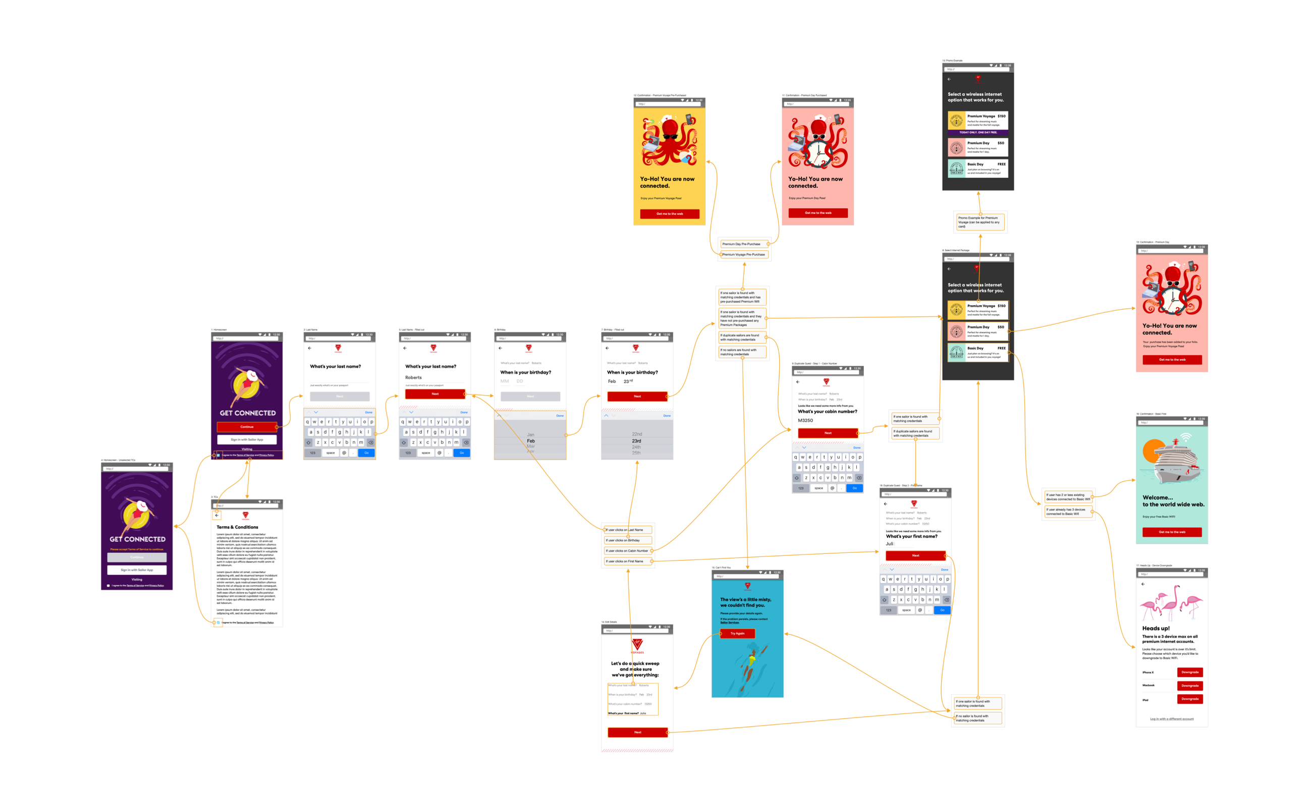
We started by breaking the larger challenge down into each individual user type. We then developed user journeys and flows that accounted for different entry points, wifi package offers, and scenarios. After competitive analysis and requirement gathering, we ideated ways to make what is typically a mundane task of setting up your wifi onboard the ship, be an experience full of surprise and delight.
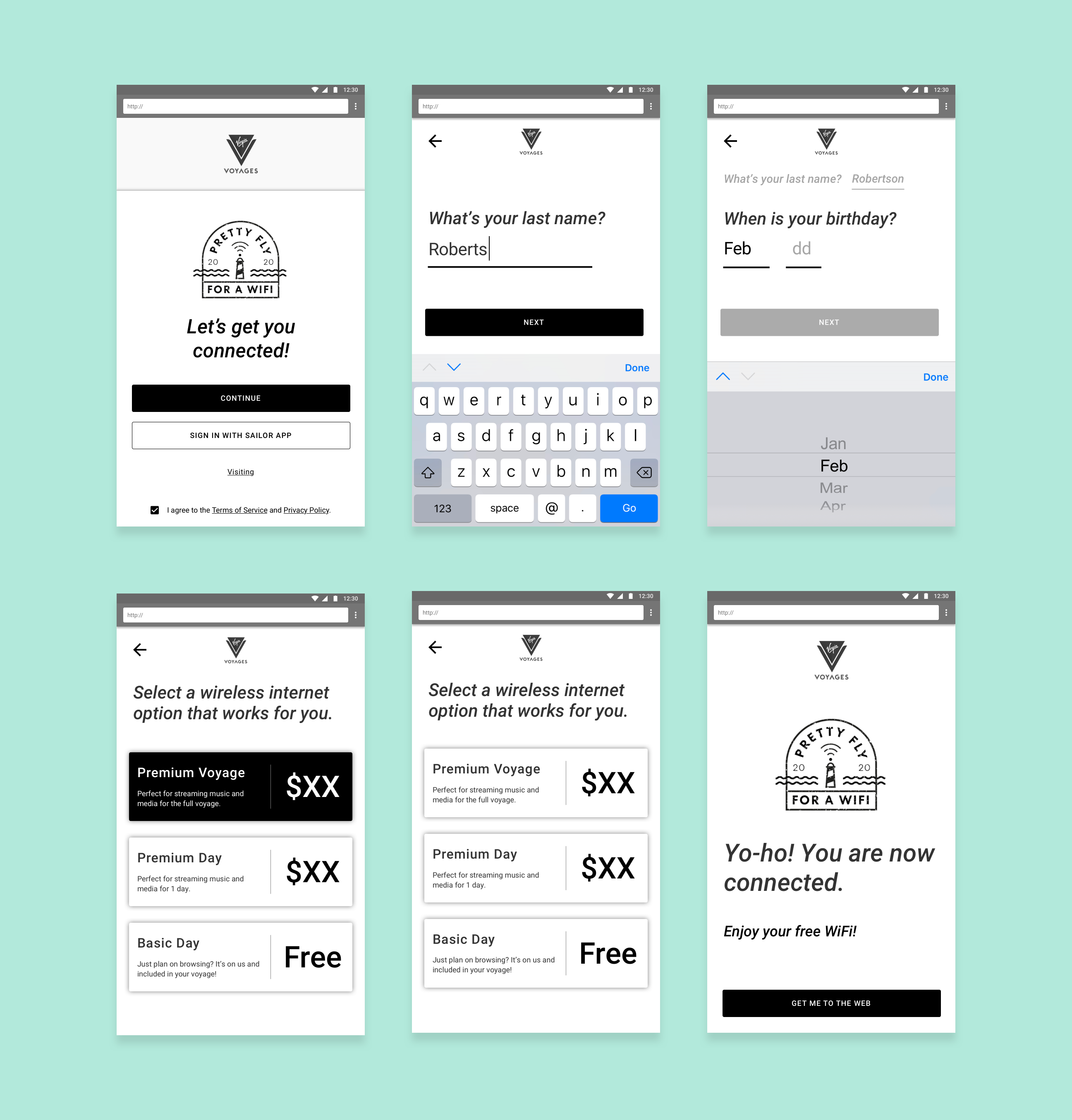
We designed ways to upsell different wifi packages in a way that felt fun and unintrusive. We also captured guests' information in a way that was structured more like a conversation to ease the frustration of filling out a form.

Custom Illustrations
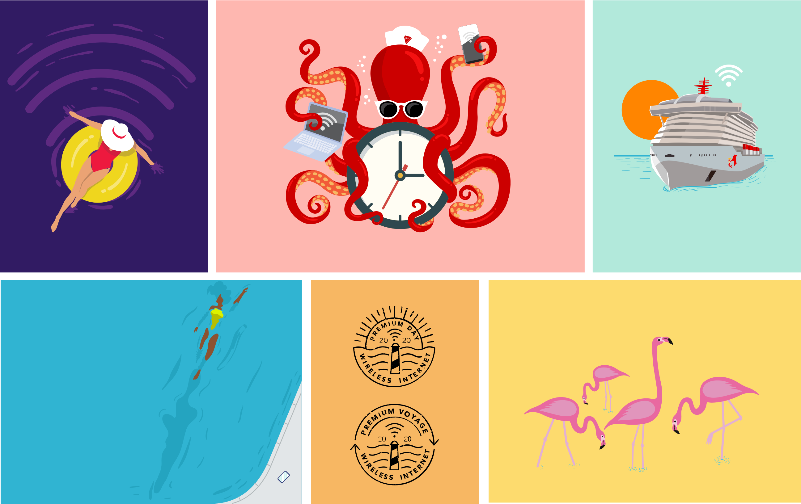
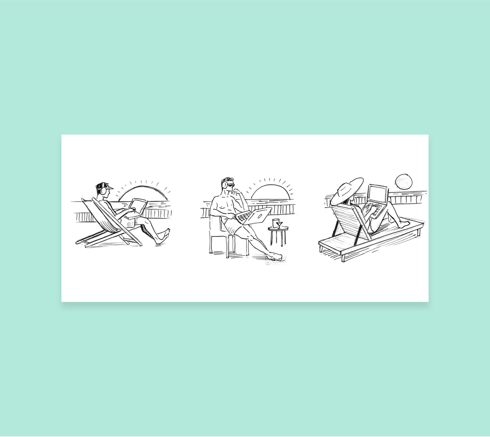
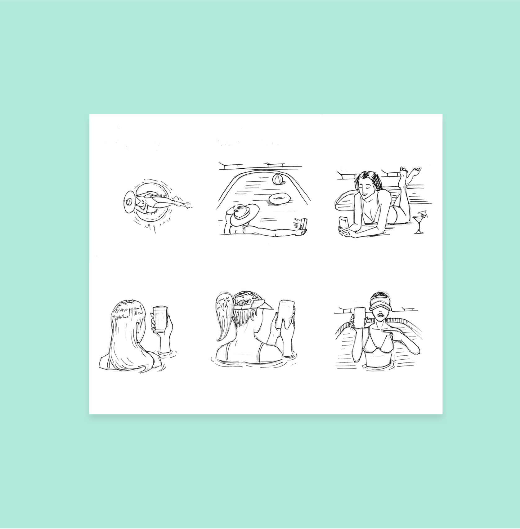
We worked closely with the Virgin Voyages creative team to create concepts for each key screen and state of the wifi sign-up process. Each concept was then hand-illustrated, colored, and refined based on the screen positioning. Custom stamps were also designed to match an existing brand stamp style for each wifi package.
Visual Design
Our UI designers were able to strike the perfect balance between the Virgin Voyages design system, our new illustrations, and the proposed user experience. In this stage of UI implementation, it all came together. User flows were redone with the finalized screens for developers to easily understand the expected experience.
The combination of bright colors, bold copy, quirky illustrations, and a smooth UX brings guests unexpected smiles—turning what is typically an awkward wifi connection process into an experience that will delightfully kick-start the vacation of a lifetime.


The Numbers
12,000+
daily users onboard
4
ships & counting
Related Work
Norwegian Cruise Line
Commitment to innovation will continue to raise the bar.
Product Design, User Experience


