
ByHeart
Well fed, however you do it.
Challenge
ByHeart is a new, innovative, infant formula vertical brand expected to launch in winter, 2021. We partnered with them to create Cluster - a judgement-free, advice-rich destination to drive peer-powered, real-time connection, offer reliable parent- and expert-approved resources, and validate a culture driven by the notion of being “well fed, however you do it.”
Our Solution
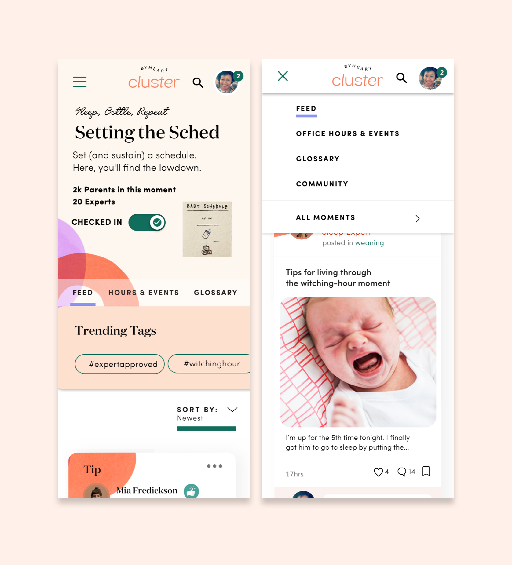
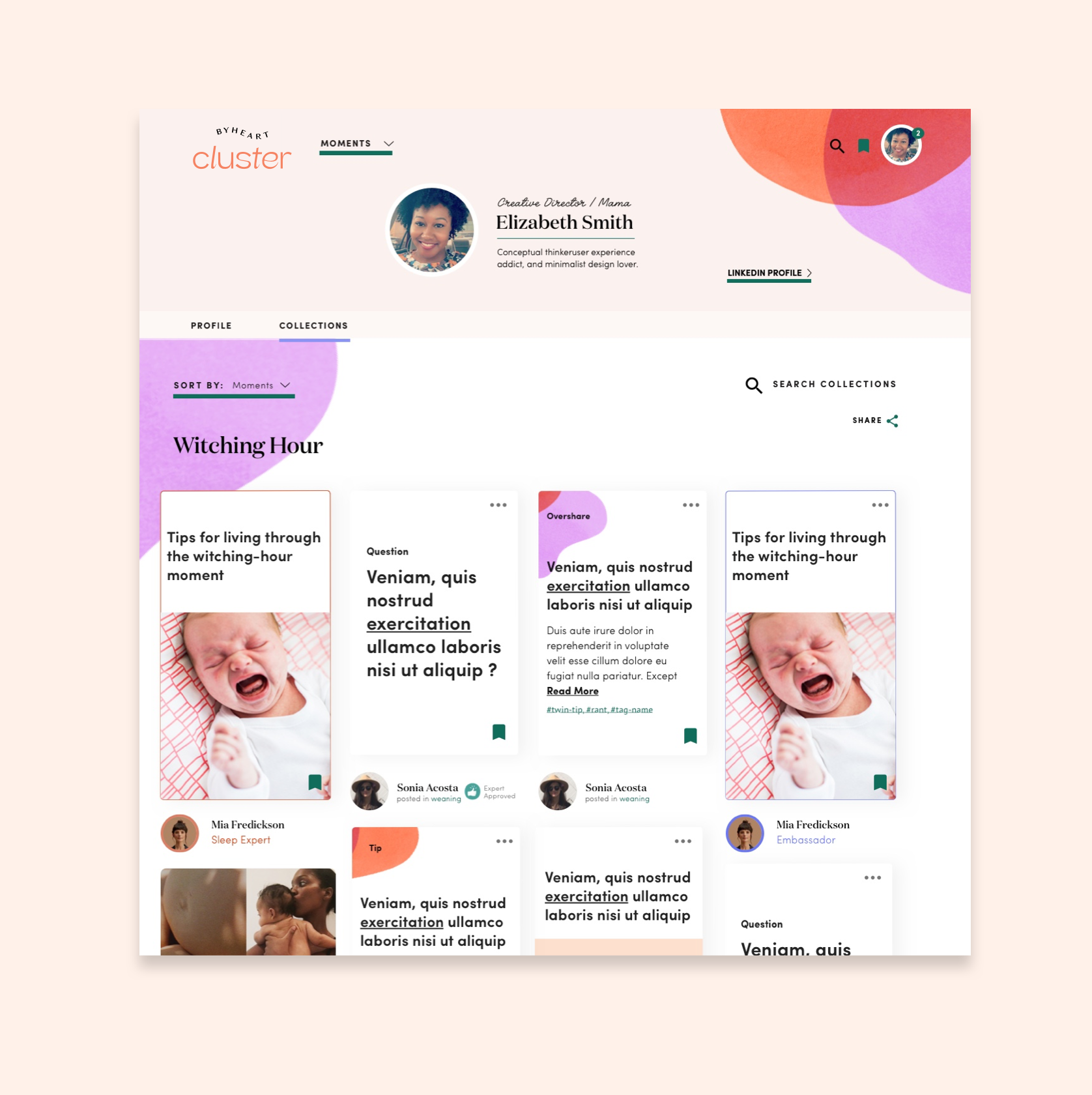
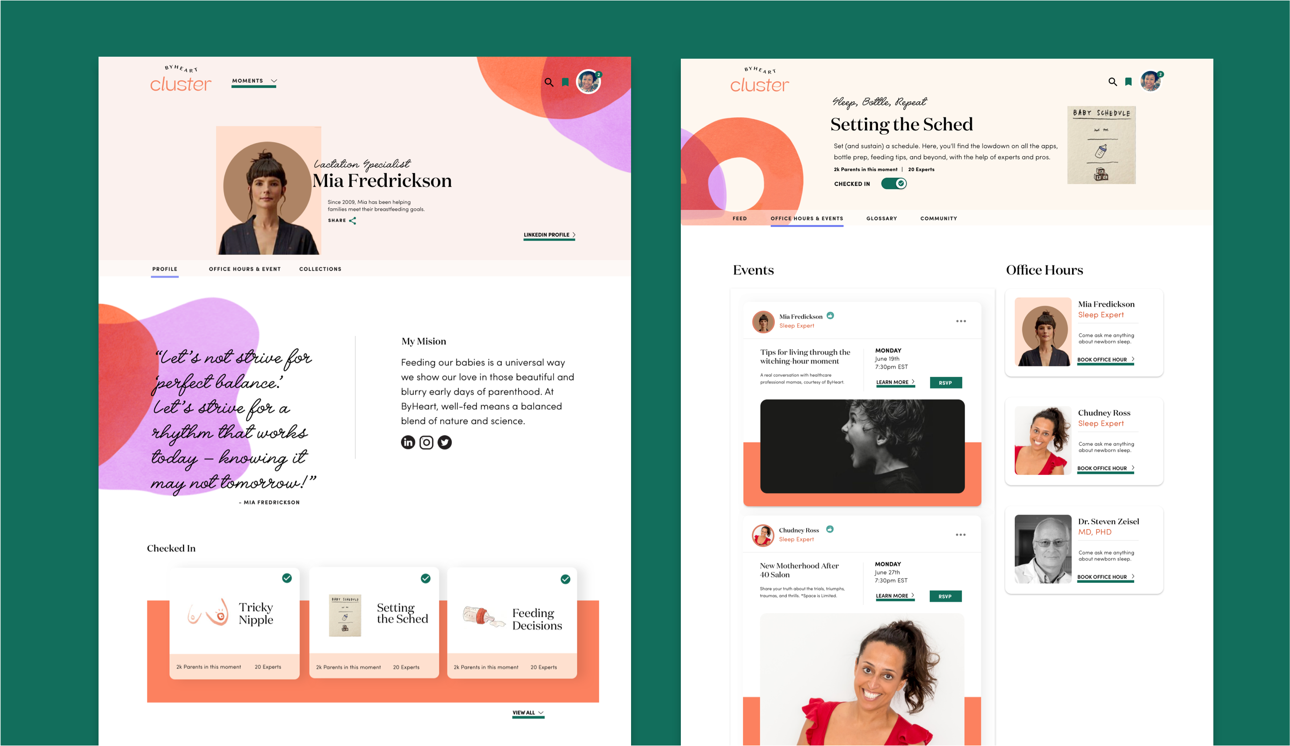
We conducted an extensive and robust discovery phase which informed our vision, strategy. and visual concept for Cluster. We then worked closely with internal stakeholders to translate their packaging brand into a digital DLS and bring it to life. The user experience we created revolves around the concept of “Moments” that new parents can check in and out of. These moments are filled with tips, questions, and overshares from experts, brand ambassadors, and other new parents within the community. The social platform designed is one that will eliminate infant-feeding stereotypes and ensure babies are fed, no matter how it’s done.
Knowledge labs
Product Design, User Experience, Strategy
Industry
E-Commerce, Health, Technology
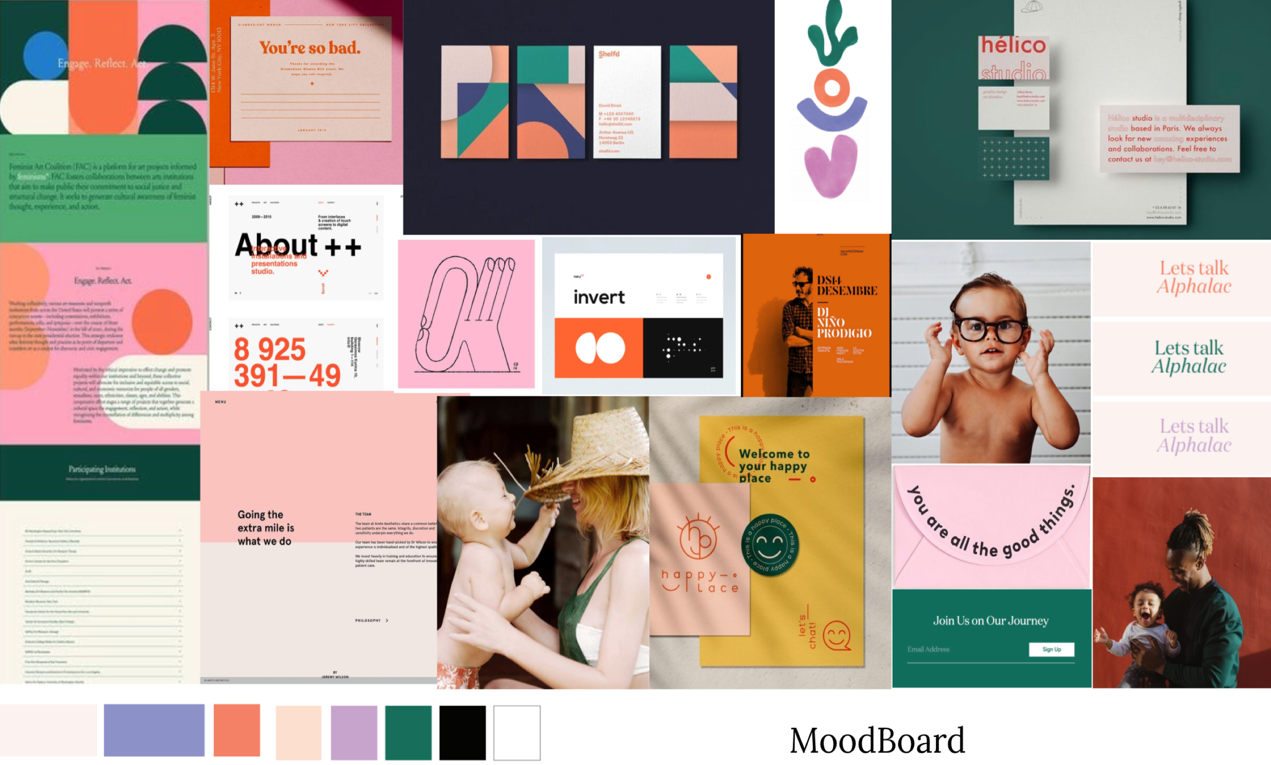
Discovery & Personas
To transform the big idea ByHeart had into a digital product, we started by extracting information from ByHeart team members and founders through in-depth stakeholder interviews.
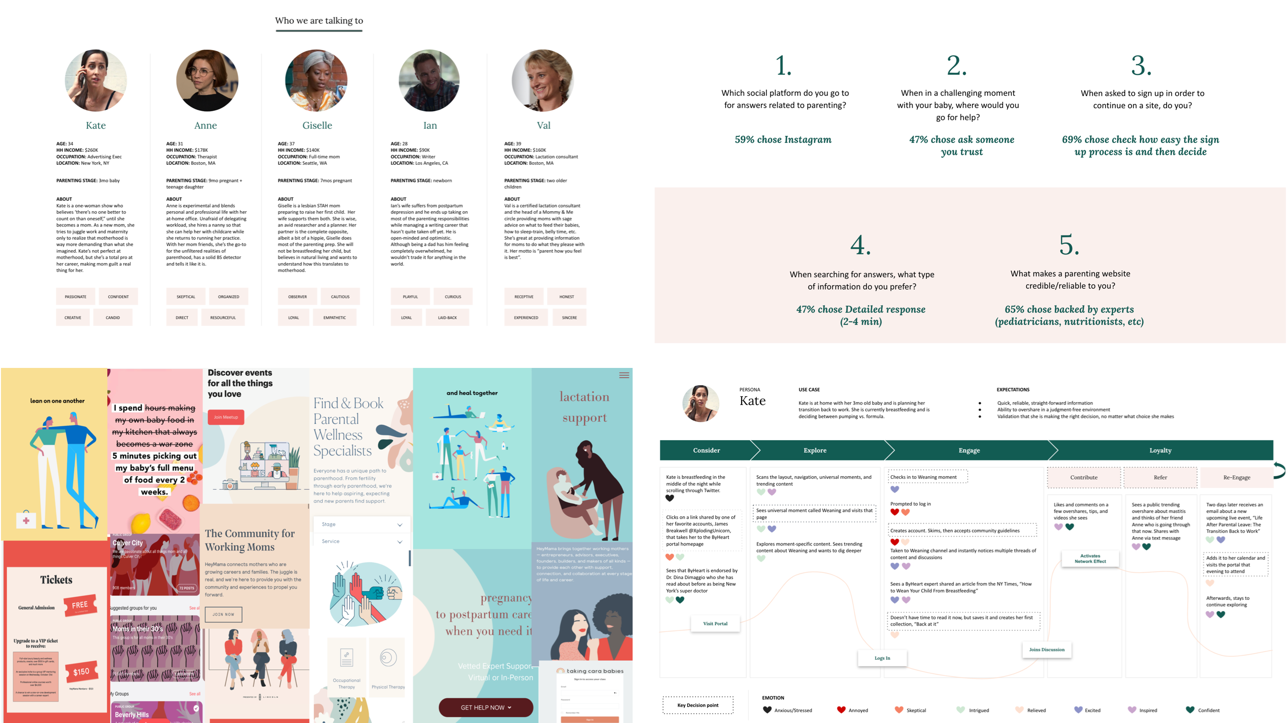
We then used that information to narrow down our target audience and create personas to represent it. The personas allowed us to develop customer journeys, discover UX opportunities, and define the digital brand style. By diving into the competition, we were able to clarify their industry niche and identify Cluster's differentiators.
Fun fact: We based the personas off of the popular Netflix series, Working Moms. This helped us and them really identify with the people who would be using the platform on a more intimate level.
User Experience
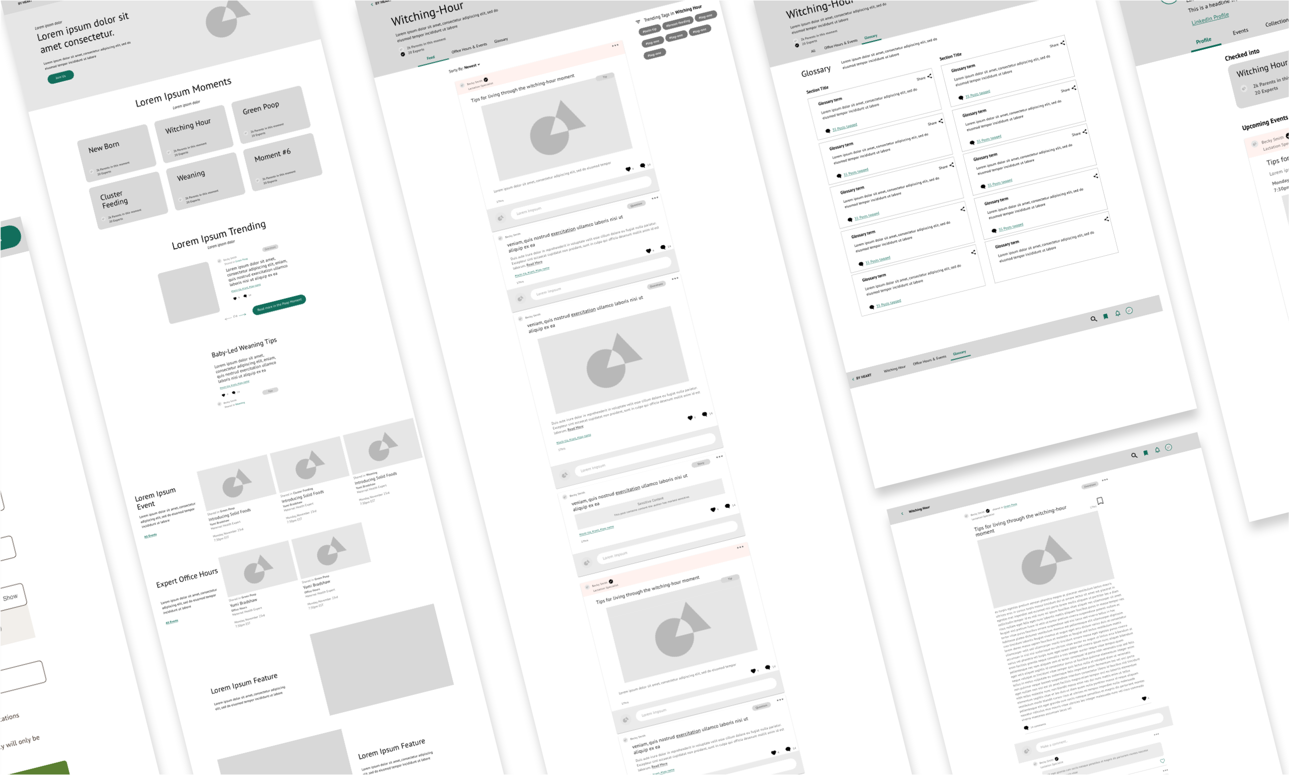
Because what we were building had never been done before, intense strategic thinking was needed to ensure user paths were clear and intuitive. We defined the UX in a very agile fashion, working hand-in-hand with visual design.
Our biggest challenge was transforming the idea of moments (meaning points in early parent/child life), into a digital experience. We used social media and community platform best practices to create a a safe space that was intuitive, engaging, and empowering enough to encourage the sharing of real parenting moments without filter.
User Interface
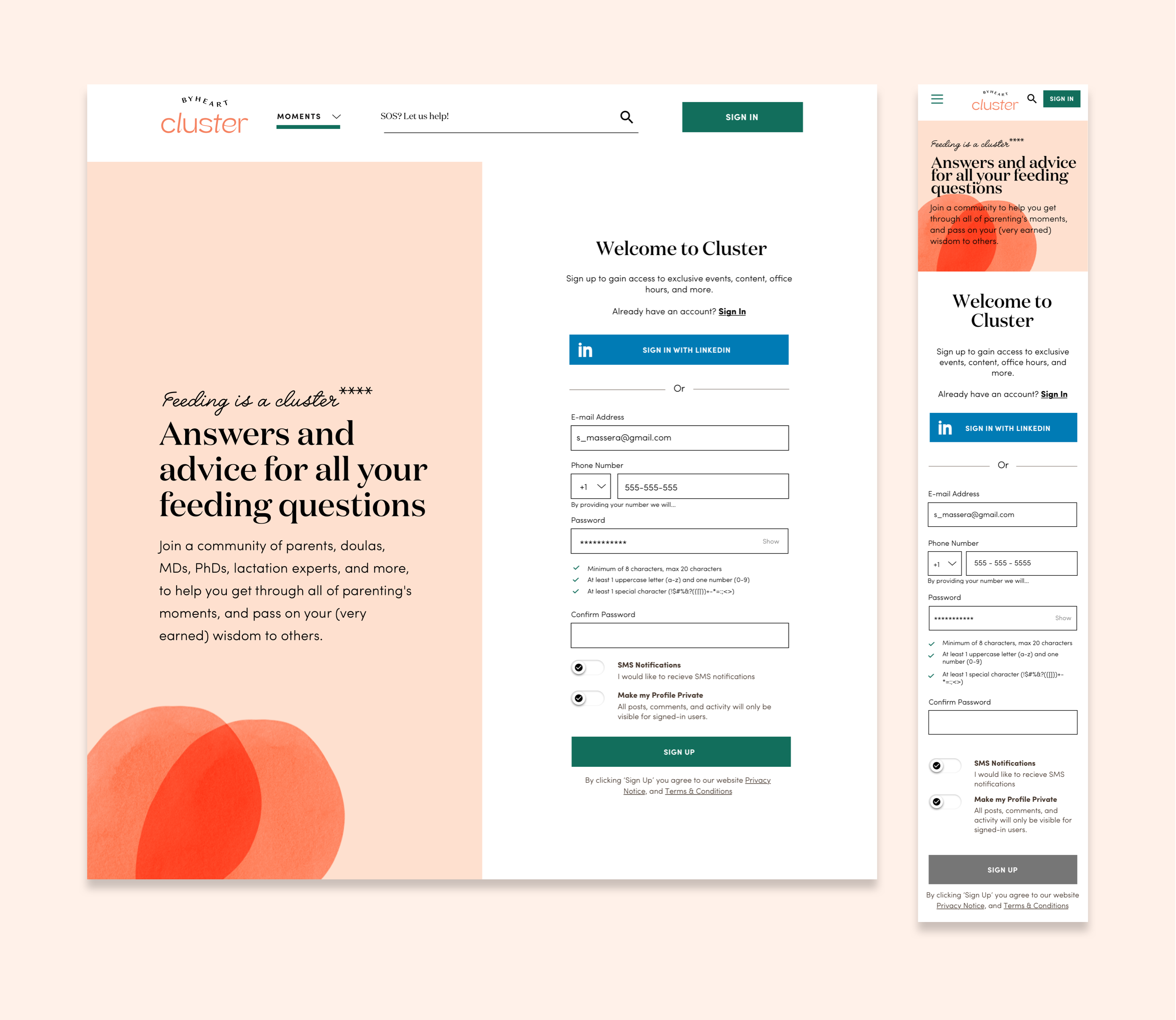
The user interface was inspired by editorial style. We use specific font pairings that allowed us to create open layouts where the user can seamlessly flow from one section to another, just like in a magazine. We also built a color and design language system that supported the complex UX requirements, helping users easily identify each person’s roll in the community and allowing them to find the right content faster.
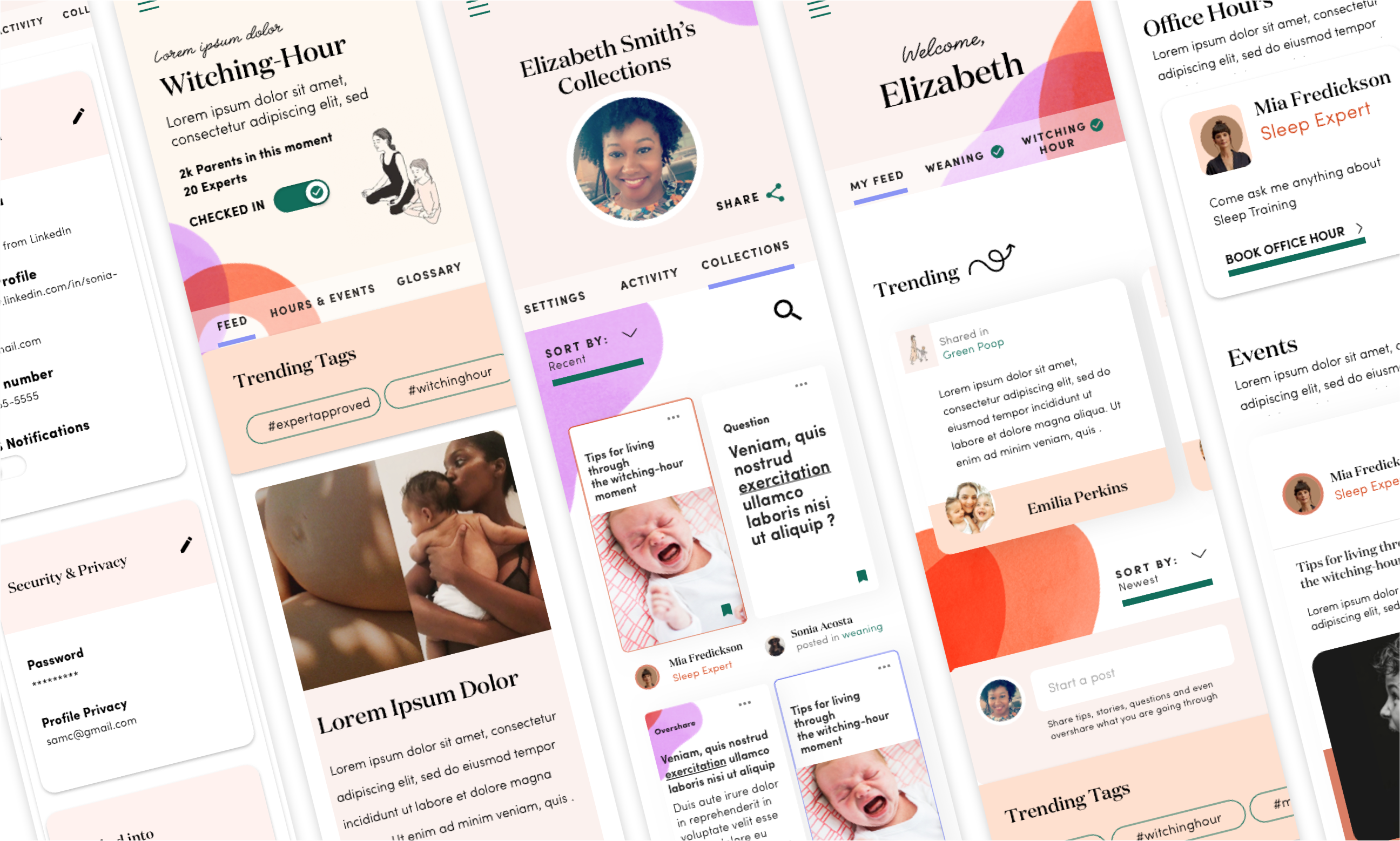
The homepage was created for two types of users - signed in and signed out. The signed out state was designed to encourage engagement by telling the brand story through community tips, expert advice, and moments.

The Numbers
31.7%
Registration rate on day 1
$90M
Raised in Series B


